Direct-to-consumer brands live on paid social. There's no shelf, no store associate and no second chance: the ad is the storefront, the salesperson and the first impression, all in a few seconds of someone's feed. And because Meta increasingly decides who sees what based on the creative itself, the ads have to do more work than ever.
What we've learned making ads for DTC brands is that no single format wins. The accounts that scale run a real mix: creator skits, product demos, comparisons, polished motion and scrappy, native content, all at the same time. That's the idea behind our work as a DTC creative agency, and it's what Meta's Andromeda update rewards.
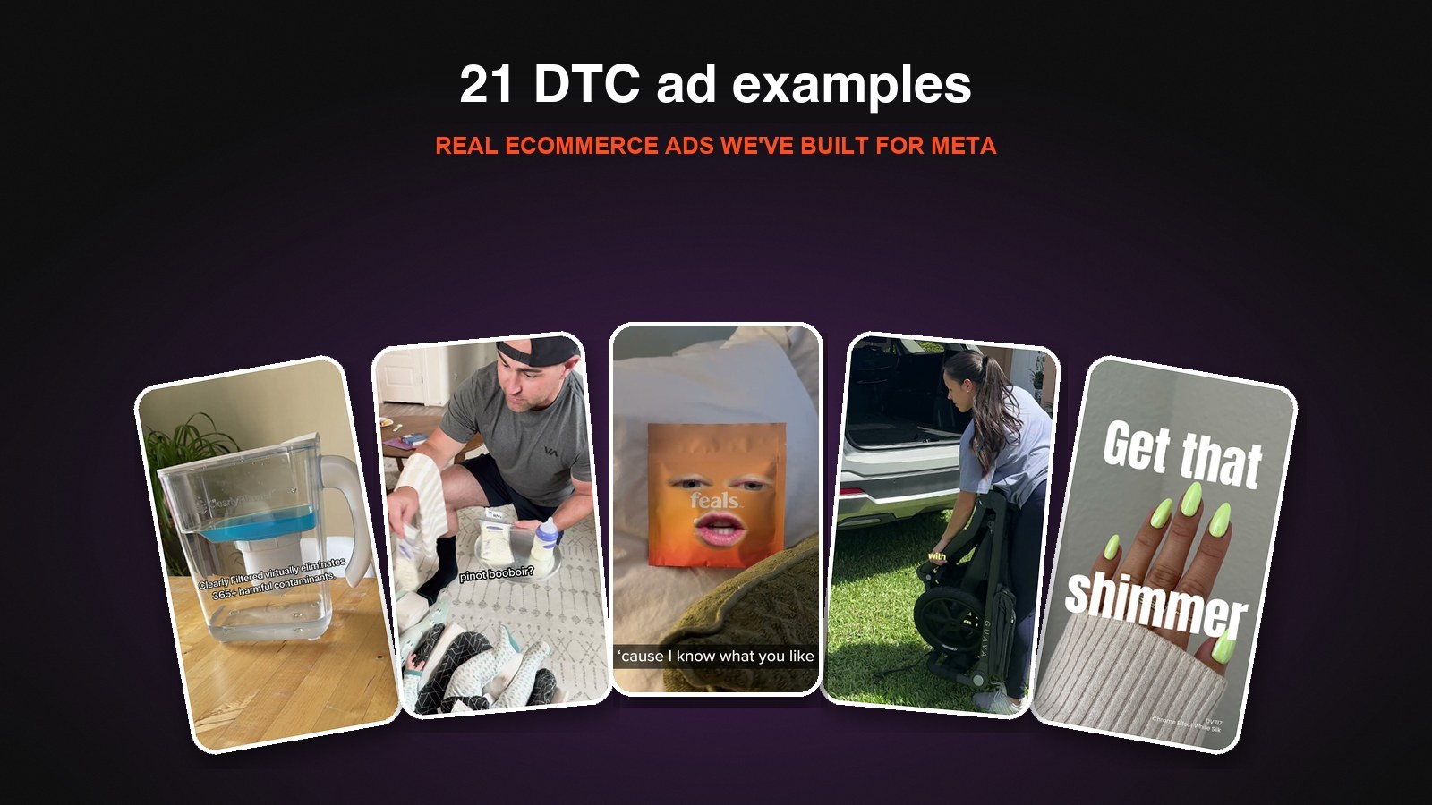
Here are 21 DTC ads we've built for ecommerce brands, from baby and beauty to home, hobby and gift brands, and what each one does well.
1. The Comedy Skit: Lansinoh's Breast Milk Sommelier
For a Lansinoh Prime Day push, a dad plays sommelier for his twin babies. "Evening, my gentlemen," he says, presenting breast milk storage bags like a wine list: "A vintage 2024," a "pinot booboir," "straight from the draft." The babies get their samples, and the ad closes on Lansinoh's milk storage bags on sale for Prime Day.
A product like milk storage bags doesn't sound exciting on paper. A skit makes it memorable, puts it in a real family's hands and gives parents a reason to share it. For a sale moment like Prime Day, entertainment gets attention that a price callout alone wouldn't.
2. The Registry Haul: "What I'm Adding as a First-Time Mom"
This Lansinoh ad uses a format expecting parents already search for: a creator's registry list. She talks over Lansinoh's product pages, walking through a $0 wearable breast pump, feeding bottles that are "anti-colic, slow flow, baby approved" and a pump that lets you "pump directly into the bottle," before ending "registered & ready."
Borrowing a native content format makes the ad feel like advice, not a pitch. And showing the real product pages behind the creator shortens the path from "that's a good idea" to "add to registry."
3. The Product Motion Piece: Lansinoh's Pregnancy Duo
The third Lansinoh ad is polished motion. "Meet your sweet dreams pregnancy duo" introduces an Itch Relief Serum and a Calming Bedtime Butter, with animated circles and callouts over real product and application shots: "soothes & cools tight bellies," "relaxes muscles with magnesium," "deeply hydrates with shea butter."
Running this next to the two creator ads above is the point. Same brand, three completely different formats: a skit, a creator haul and a polished product piece. That's the kind of creative diversity that gives Meta more ways to find buyers. We make this kind of work on our motion ad agency side.
4. The Head-to-Head Comparison: Guava Roam vs. BOB
For Guava, a creator stands between two jogging strollers, the Guava Roam and a BOB, and explains why the Roam comes out ahead. Labels and motion callouts break it down: how each one handles rough terrain, a side-by-side of both folded, and the Roam's zero-maintenance airless tires. She wraps with "If you want one stroller to do it all, I'd say your best bet by far is the Roam."
Comparison ads work because shoppers are already comparing. Naming the category leader and showing, point by point, where you win gives a considered purchase like a stroller the proof it needs.
5. The Visual Demo: Clearly Filtered's "Will It Filter?"
This ad opens with a blue sports drink poured into a Clearly Filtered pitcher and the line "I heard this water filter was good but WOW." In a sped-up timelapse, the blue drains out clear while the ad notes that Clearly Filtered "virtually eliminates 365+ harmful contaminants." It ends with a glass of clear water: "It's so delicious I don't buy bottled water anymore."
A water filter's benefit is invisible, so the ad makes it visible. One simple, slightly surprising demo does more than a list of certifications. (Note the on-screen disclaimer that the footage is sped up and the drink is demonstrative. It keeps a bold demo honest.)
6. The Talking Product: Feals' Bedtime Lullaby
For Feals' sleep gummies, the bag itself comes to life with a human face and whispers a bedtime rap: "Hey little mama, lemme whisper in your ear, it's almost 10 o'clock, your bedtime's near. I laid out your gummies 'cause I know what you like." It tucks itself into bed with "clean fresh sheets" and "fluffy pillows" before landing the benefit: "drift off to sleep without drifting to outer space."
It's weird, funny and impossible to scroll past, and the last line quietly handles the biggest objection to sleep aids: feeling groggy or out of it.
7. The Trend Hijack: DND's Viral Chrome
For DND, a nail polish brand, the ad opens on a desktop folder labeled "trending chromes," then cuts to the product: "DND chrome went viral." A quick demo shows the powder going on over "any polish with a silvery finish," followed by a fast run of manicures in blue, orange, green and pink under the line "Get that shimmer."
When a trend is already happening, the fastest ad is one that points at it and says "this is how you get it." The color montage then shows range without needing a single word.
8. The Sticker-Style Product Showcase: Jukebox
For Jukebox's natural deodorant and soap, the ad pairs real product shots with playful illustrated stickers that match each scent: watermelon, lavender, butterflies and vanilla. It moves through "No aluminum deodorant," "Amazing soap scents," "Perfect lather!" and "Top rated scents" before closing on an offer.
Stickers and doodles are a simple way to give a product ad personality without a big shoot. They also turn scent, something you can't show on screen, into something you can see.
9. The Maker-Focused Launch: CandleScience's First Soy Wax
CandleScience sells candle-making supplies, so its buyers are makers who care about results and margins. This launch ad introduces its first-ever soy wax with clean, sunlit product shots and simple lines: "100% plant-based," "designed for makers who demand consistency, cleaner burns + better margins," "consistent finishes batch-to-batch" and "reliable, lab tested, maker-approved." It closes on "Good wax. Great margins."
Knowing exactly who you're selling to changes the whole ad. Here, the pitch isn't cozy candles. It's performance and profit, because that's what a small candle business needs to hear.
10. The Creator Tutorial: Verb Hydrating Oil
This Verb ad is a long-form creator tutorial. She opens with "I have really dry, frizzy hair," shows what it looks like before, then works the hydrating oil through her hair on camera, brushing and styling as she talks, until "it's really hydrated and really shiny."
Not every ad needs to be 15 seconds. For beauty and haircare, a real person showing a real before and after, at a natural pace, builds the kind of trust that makes someone try a new product. See more formats like this in our UGC ad examples.
The next 11 come from home, hobby and gift brands: water filters, power tools, candle-making supplies, board games, jewelry and dog food. They're products people don't strictly need, from brands they often haven't heard of, competing with options they already own.
11. The Familiar Alternative: Clearly Filtered's "That Popular Water Bottle"
"You could get that popular water bottle everyone has," the ad opens, over one of the trendy tumblers. "Or you could get this Filtered Water Bottle," and the Clearly Filtered bottle slides in as the other one greys out. Then the filter goes in, and the ad gets to the point: it removes up to 220+ contaminants from tap water.
As we wrote in our newsletter: "People love their water bottles. We don't need to convince them why water bottles are good, just that ours is different and better." Opening on a bottle everyone recognizes stops the scroll, and the whole comparison is done in the first three seconds.
12. The Category Contrast: Jukebox vs. Basic Body Soap
A plain white bar of soap sits alone on a cream background: "You're too epic for basic body soap." Then the screen flips to hot pink and a watermelon-scented Jukebox bar: "Jukebox is your vibe." Natural ingredients, irresistible scents, blissful bubbles. Done.
"No matter how unique your product, there are undoubtedly many alternatives to it. So you need to show how your product compares." Here the boring white bar does the work, and Jukebox looks more fun before it says a word. And it's all "in 10 seconds flat."
13. The Three-Second Problem: Casely's Tangled Chargers
It opens on a hand digging through a bag of tangled cords: "Still tangled in phone chargers?" Three seconds in, the Power Pod appears. Then a quick checklist against a regular cable (wireless charging, portable and magnetic, "bodacious designs") and a run of patterns.
The hook and the first three seconds show both the problem and the solution. Then the ad switches from native footage to motion graphics. "People most often talk about the two styles separately but forget that they can be used in tandem."
14. The Myth-Buster: Cloud Water Filters on Reverse Osmosis
"MYTH: Reverse osmosis systems waste a ton of water." The ad explains why most systems do, then shows how Cloud's system is designed differently, with custom animation of water moving through the filter.
It opens on the objection that stops people from buying, not on the product, and the animation makes something invisible easy to follow. "Even if the viewer isn't in-market for a home water filtration system, they leave the ad learning a little something new."
15. The Lineup Explainer: Dremel's Three Tools
"3 powerful tools, each with their own strengths." Then each rotary tool at work, engraving, sanding and cutting, with a little animation to spotlight the one on screen.
The headline opens a loop, so you keep watching to find out what each tool is good for. It also answers the question that quietly kills sales: which one should I buy? "If your customers are constantly asking, 'Which one is right for me?', you're losing money. A confused mind doesn't buy." Showing how the tools fit together can also get people to buy more than one.
16. The Cliffhanger: Underdog Games' "Favorite Game of the Year"
"Before I reveal my new favorite game of the year, you need to know 2 things." One: it's the best game for all ages the creator's family has played. Two: it feels like Back to the Future as a board game. Only then does the name come up: Trekking Through History.
"Building a little cliffhanger at the beginning of your ad should increase your hook and hold rates." It's the same trick TV shows use at the end of every episode, and it keeps people around long enough to learn why they'd want the game.
17. The Hybrid Product Tour: Sundays for Dogs
Thought bubbles float over a dog's head, one with a steak and one with kibble, and they collide and pop. From there it's a full product tour: the box arriving, "gently air-dried," the real ingredients, a happy dog at the bowl and "The best part?"
A playful hook buys time for a lot of information. It's "a nice hybrid concept, a mix of high-production video, animation, and native footage," so a full product overview never feels like a spec sheet.
18. The Behind-the-Scenes: CustomMade's Tattoo Ring
A custom engagement ring in its box, then the story behind it: a customer's tattoo becomes the design for the band, and the ad walks through the sketches that turned it into the finished ring.
"People love seeing the behind the scenes of how something is made." Custom jewelry is a natural fit, but the idea works for almost anything. If your product isn't customizable, tell the origin story instead: "Show us the initial sketches. Share how you came up with the idea."
19. The Timelapse: Topspin Pro's 100 Reps
"How do I hit 100+ reps without fetching a single ball?" A player swings again and again in his living room, sped up, while short lines of copy cover the benefits.
Video has three modes: regular, slow motion and timelapse. Most ads only use the first, "which means just by using slo-mo or timelapse we can stand out." A hundred reps in real time would be boring. In timelapse, it's the proof.
20. The Result-First Hook: Sleepy Tie's Overnight Curls
It opens on the finished curls with "Get curls overnight" popping up behind her. Then a framed UGC clip shows how to put the Curly Tie in, and it ends on the result.
"We're showing the results and making a big promise that should keep people watching." The opening shot is the same clip as the ending, cut out and placed on a clean background. It's a good reminder that you can get a new hook out of footage you already have.
21. The Real Party: CandleScience's Candle-Making Night
A group of friends gets together to make candles: pouring wax, picking scents, laughing and showing off what they made at the end.
Filming people learning a craft in real time "could go horribly wrong," but the goal was for it to "feel like native content that would interest a crafting audience" and "like real friends throwing a real party." That's where UGC is heading: "it needs to feel either totally organic, or it needs to feel like the person is a part of the brand."
What These DTC Ads Have in Common
- Every brand runs more than one format. Lansinoh alone appears here as a skit, a creator haul and a motion piece, and Clearly Filtered, Jukebox and CandleScience each show up twice in completely different styles. That range is what keeps an account scaling.
- They make invisible benefits visible. Filtration, scent, sleep and hydration are hard to show. Each ad finds a visual way in.
- They name the alternative. The popular water bottle, basic body soap, a tangle of chargers, the category leader's stroller. Shoppers are already comparing, so show them the comparison.
- They give people a reason to keep watching. A cliffhanger, an open loop, a myth or a popping thought bubble buys time for the pitch.
- They borrow formats people already watch. Registry hauls, trend videos, tutorials and comparisons feel like content, not ads.
- They know the buyer. New parents, makers, trend-driven beauty shoppers: each ad speaks to one specific person.
- They mix polished and native. UGC, motion, statics and hybrids each do a different job.
For more, see our breakdowns of UGC hybrid ads and GIF-style moving stills, our Meta ad hook examples, or what it costs to hire a creative agency for Meta ads.
Work With the Team Behind These Ads
Biddyco is a DTC creative agency for ecommerce brands spending $100K–$5M+/month on Meta. Our in-house team makes UGC, motion, hybrid and static ads on a flat monthly retainer, built for the creative diversity it takes to scale.
FAQ
What makes a good DTC ad?
A good DTC ad shows a problem the buyer recognizes, introduces the product as the answer within a few seconds and backs it up with proof: a demo, a comparison or real customers. It looks like something people would stop for in their feed, not a catalog listing.
What kinds of DTC ads work best on Meta?
Creator UGC, comparisons, product demos, motion explainers and hybrids that mix them. The accounts that scale test several different types at once, because each one reaches different buyers.
How do you make a DTC ad stand out?
Change the format, not just the copy. A skit, a timelapse, a behind-the-scenes look or a cliffhanger stands out against the usual talking head and product shot.
Should DTC ads compare products to competitors?
Comparisons work because shoppers are already comparing. You can name the category leader, like Guava vs. BOB, or compare against a familiar alternative, like "basic body soap," which gets most of the contrast with less legal risk.
How many DTC ads should a brand test?
Enough to give Meta real variety. A mix of genuinely different formats and angles, refreshed every few weeks, does more than many small variations of one ad.