A static ad is a single-image ad: one frame, no video. On Meta, static advertising covers single-image ads in Feed, Stories and Reels, carousels, and one-frame videos (statics with just enough motion to catch the eye). Statics are the fastest way to test a message, and in our data from 17 accounts spending $100K+ a month, they took about a third of spend.
Looking for inspiration first? See our static ad examples from real client accounts.
Key Takeaways
- Statics are far from dead. In our data from 17 accounts spending $100K+ a month, statics took about a third of spend, were 4 in 10 of the top-spending ads, and had a cost per purchase within 4% of video's in the median account.
- A static only gets one frame, so every decision shows. The best ones pick one idea and make it obvious.
- The headline does the hooking. Write it before you design anything.
- Borrow visuals people already understand: comparisons, checklists, toggles, grids and callout lines are read instantly.
- Put the proof in the frame. Stats, ingredients, reviews and comparisons give a static the credibility a video builds over 30 seconds.
- Statics are the fastest way to find a winning message. When one wins, add motion to it and carry it into video.
Video gets most of the attention in Meta advertising. Statics quietly do a lot of the work.
They're fast to make and cheap to test. A good one says everything in the time it takes someone to glance at it, which is often all the time you get. And in accounts that scale, they earn a real share of the budget.
But statics also have a reputation problem. The lazy version is everywhere: a product photo, a stock gradient, a headline that could belong to any brand in the category. Fifty of them, made in an afternoon with a template.
This guide walks through how we make static ads for brands spending $100K to $5M+ a month on Meta, step by step, with real examples from our clients. It covers the message, the headline, layout, proof, design, offers, one-frame videos and testing.
What Is a Static Ad?
On Meta, the static category usually includes:
- Single-image ads in Feed, Stories and Reels placements
- Carousels, a set of images people swipe through
- One-frame videos, statics with just enough motion to catch the eye, which Meta delivers as video
The format is simple. Doing it well isn't. With one frame, the headline, image, layout and what you leave out all have to work together instantly.
Static Ads vs. Dynamic Ads
A static ad is a fixed creative you design once, and everyone who sees it sees the same thing. A dynamic ad on Meta (Advantage+ catalog ads) pulls product images and prices from your catalog and changes based on who's viewing. Most brands use both: dynamic ads to show people products they've already looked at, and designed statics to sell a message to people who haven't.
Why Statics Still Matter
We looked at the top 50 ads by spend in 17 US accounts, 848 ads and $14.9M in spend. Here's what we found:
- Video took about two-thirds of spend (68%), and statics took one-third (32%).
- 4 in 10 top-spending ads were statics, including 73 of the 170 ads that ranked in their account's top 10.
- Statics cost about 15% less per 1,000 impressions, but got about 13% fewer clicks per impression.
- In the median account, statics' cost per purchase was within 4% of video's.
- 14 of 17 accounts had at least one static in their top 10 ads.
Neither format wins outright. The accounts in this data scale with both. You can see the full breakdown in static vs. video ads on Meta, part of our Meta Ads Statistics hub.
Statics also have a job video can't do as well: they're the fastest way to test a message. Because they're quick to make, new angles, offers and headlines get in front of buyers sooner, and you learn what resonates before you invest in bigger productions.
Step 1: Find the Message Before You Design
The best static is built on something real. Not a color palette or a layout idea, but a message worth testing.
Good places to find it:
- Customer reviews. The exact words people use to describe the problem and the result.
- Your account data. Which angles and offers are already working in other formats?
- Sales and support conversations. The objections and questions that keep coming up.
- Competitors. What everyone else in your category is saying, and what they're missing.
Then pick one angle per ad: one problem, one benefit, one offer, one comparison. If you can't say what the ad is about in a single sentence, it isn't ready to design.
Step 2: Write the Headline First
In a static, the headline is the hook. It has to stop the scroll and call out the right person in about two seconds.
Strong static headlines tend to:
- Name a specific moment the buyer recognizes
- Ask the question they're already asking
- Make one clear promise
- Mirror the buyer's own job or life
- Say something a little unexpected
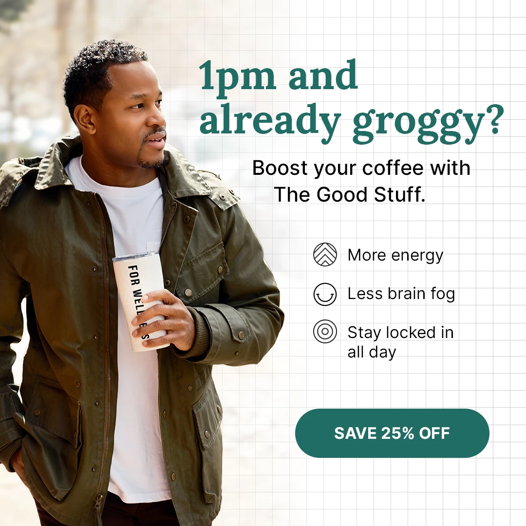
For For Wellness's coffee booster, the headline is "1pm and already groggy?" It opens with a moment, not a product name, so the right person recognizes themselves instantly. Three simple benefit icons and a "Save 25% off" button do the rest.
Write several headlines for every concept. The headline is the cheapest part of a static to change, and often the biggest lever on performance.
Step 3: One Idea Per Image
A static that tries to say everything ends up saying nothing. Three benefits, a logo wall, a discount and a review all fighting for the same frame means the viewer has to find the point. Most won't bother.
Pick the single idea the ad is about, and let everything else support it.
For ZBiotics, a diagonal line splits the frame in two. On top, friends toast champagne under "For great nights." Below, a woman stretches on a running track under "And better mornings." The bottle sits across both halves, holding the story together.
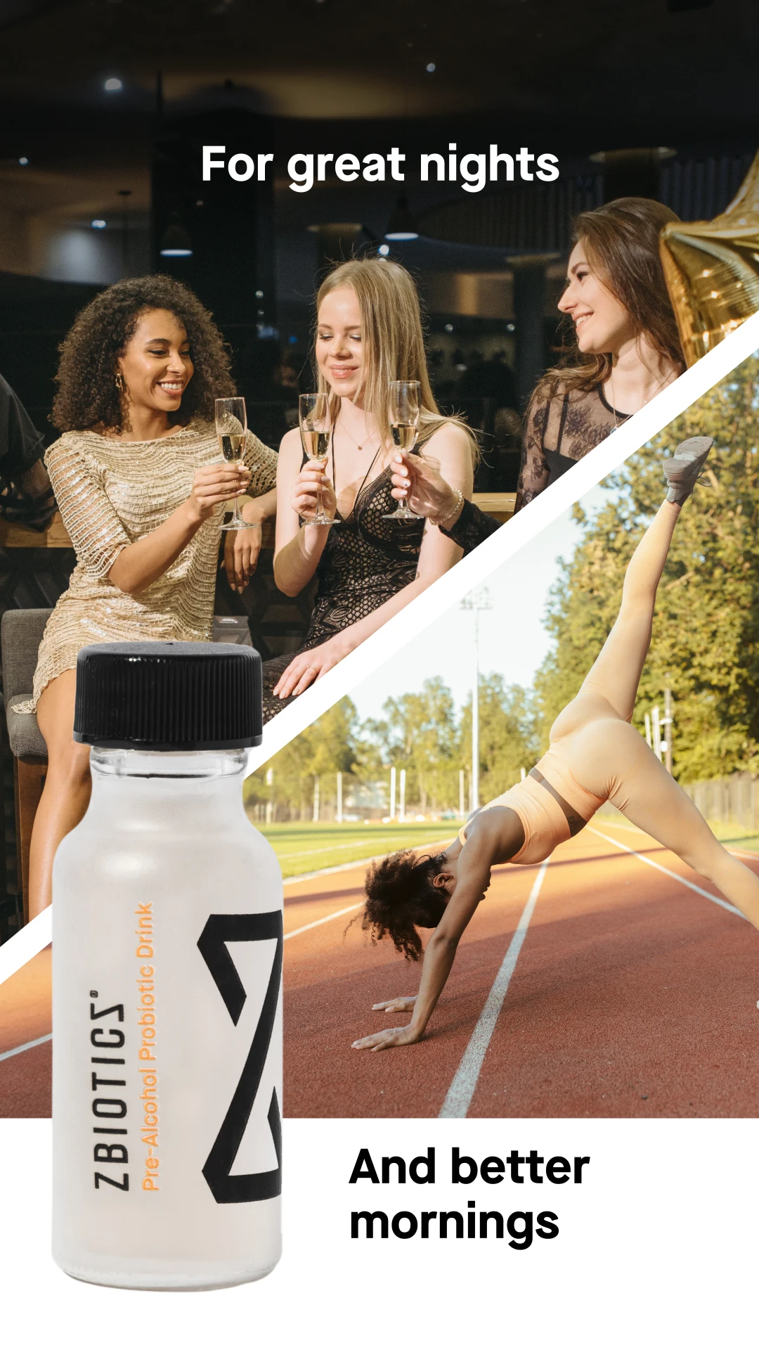
A split scene tells a before-and-after story without a single claim. The product is literally the bridge between the two moments, so you understand what it's for in one look.
Step 4: Borrow a Layout People Already Understand
People read familiar layouts instantly. That's a huge advantage when you only have a glance.
Some of the layout patterns we use most:
- The split scene: two moments, with the product in between
- Us vs. them: your product next to the alternative
- The toggle checklist: phone-style switches for what's in and what's out
- The stat stack: big numbers down the side of the product
- The annotated product: callout lines pointing to each benefit
- The photo grid: many customers or use cases in one image
- The oversized product: the product scaled up to landmark size
- The editorial lifestyle shot: the product styled like a magazine spread
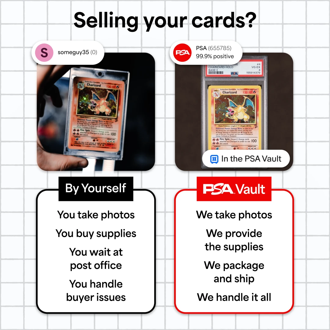
Comparison layouts work because shoppers are already weighing their options. For PSA Vault, the ad asks "Selling your cards?" and compares selling by yourself, with four chores underneath, against PSA Vault handling all four. The seller badges borrow the look of a marketplace listing to show trust without saying the word.
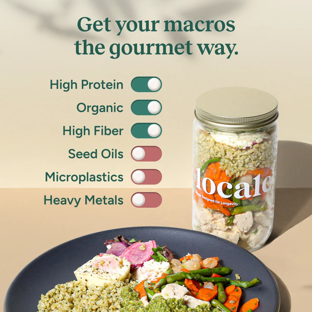
Borrowed UI elements work the same way. For Locale, a column of phone-style switches is turned on for "High Protein," "Organic" and "High Fiber," and turned off for "Seed Oils," "Microplastics" and "Heavy Metals." It turns a list of claims into something quick and scannable.
You can see all of these patterns with real examples in 12 static ad examples for Meta.
Step 5: Put the Proof in the Frame
A video has 30 seconds to build trust. A static has one frame. So the proof has to be right there.
Proof that works in statics:
- Stats with a clear source
- Ingredients or specs, especially what's not in the product
- Reviews and ratings
- Press logos or headlines
- Comparisons against the alternative
- Before-and-after, where your category allows it
For SeroVital Hair Regeneres, the headline makes the emotional promise, "Fuller hair is your future," and a framed callout backs it up: "91% of women experienced less hair loss*," with the study details in the footnote.
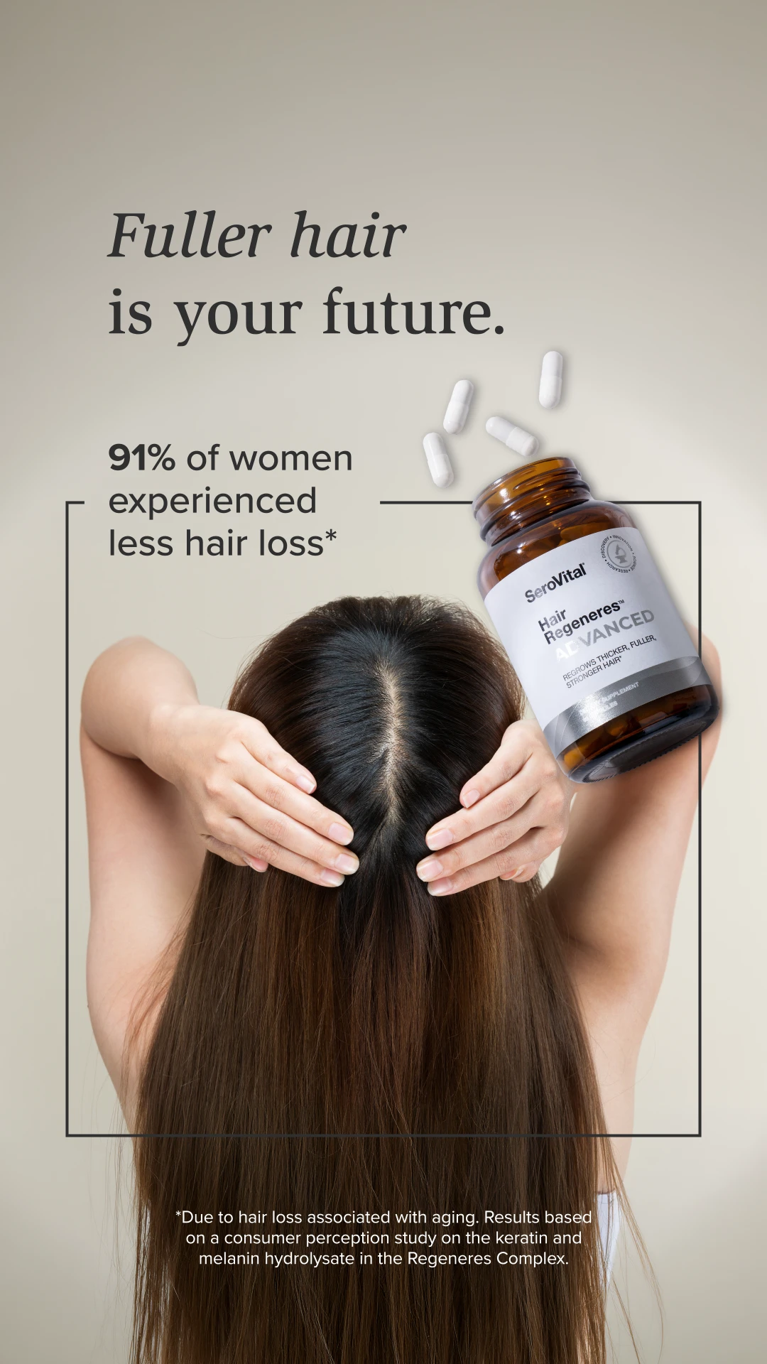
For supplements and skincare, that footnote matters. A specific, sourced number is more convincing, and safer, than a vague claim. When a product's selling point is completeness, numbers make it concrete. For more, see 11 ways we build press and social proof into Meta ads.
Step 6: Design for the Feed
Statics are seen small, fast and on a phone. Design for that.
- Clear hierarchy. The eye should land on the headline or the product first, then the proof, then the call to action.
- Readable at thumb size. If you have to zoom in to read the stat, it isn't working.
- A strong focal point. One big image or product beats several small ones.
- Your brand's look. Fonts, colors and photography that belong to you, not a template.
- Every placement. Build for 1:1 and 4:5 in Feed and 9:16 in Stories and Reels, with key text inside the safe zones.
Simple visual tricks can do a lot. For Every Man Jack, a giant deodorant stick towers over a coastal trail as a hiker heads toward the ocean. Scaling the product up to landmark size stops the scroll and keeps it the hero, while the outdoor setting does the positioning: this is deodorant for people who actually sweat.

Made by Hand, Not Templated
AI and templates make it easy to produce a hundred statics in a day. They also make it easy to produce a hundred statics that look like everyone else's. Meta's Andromeda update reads what's actually in your ads, and near-duplicates get treated as the same creative. More on that in Meta Andromeda.
We still make most of our statics by hand. Volume only helps if every ad is good enough to represent your brand, and different enough to count.
Step 7: Make the Offer and the Next Step Obvious
If the ad has an offer, don't hide it in small print. Sometimes the offer is the hook.
For Collective, the headline leads with the price, because in that category price is the biggest question: "We priced GLP-1s fairly. Apparently that's disruptive." The offer lands with the price circled: $59 a month, same price at every dose.

A few rules for offers and calls to action:
- Match the offer to the landing page. If the ad says 25% off, the page should too.
- Use a button-style CTA when it fits. People recognize it as something to tap.
- One action per ad. Shop, sign up or learn more, not all three.
Step 8: Add Motion With One-Frame Videos
A one-frame video is a static with just enough movement to catch the eye: a headline that builds, a product that floats, a ring of benefits that rotates. They're not technically GIFs, but they give you the same movement, and Meta delivers them as video.
That means they add format diversity to your account without the time and cost of a full video or motion ad.
For Huel Black Edition, the static is simple: a hand holding a glass against a bright yellow background. The motion tells the story. "This is a meal." types in first, then "Not a protein shake." appears and gets struck through, and three stat boxes pop in at the bottom.
One of the easiest wins in any account is taking a static that already performs and adding slight motion to it. The message is proven, the design is done, and the movement gives it a fresh way to stop the scroll.
For Material's cutting boards, a short loop sits under an "As seen in" label while the press logo underneath cycles through a dozen publications. A static can only fit one or two logos before it gets crowded. Cycling them turns one press line into a long list of credibility.
See 10 GIF-style moving stills we've built for more.
Step 9: Make Lots of Them, and Make Them Different
Statics are the fastest format to produce, so they're the easiest way to add volume and range to an account. But volume only helps if the ads are genuinely different.
Twenty statics with the same layout in different colors are one idea, twenty times. Meta treats them that way too. Real diversity comes from changing:
- The angle: a different problem, benefit or story
- The audience: who the ad speaks to
- The layout: comparison, grid, stat stack, lifestyle
- The proof: stats, reviews, press, ingredients
- The format: static, carousel, one-frame video
A grid is a simple way to show range in one image. For Wilderdog, four dogs in four landscapes, from desert to mountains to forest, all wear the harness, with the product floating at the center. It also feels like a customer photo wall, which quietly signals that lots of people use and love it.

For more on why this matters, see what creative diversity on Meta actually means.
Step 10: Test, Learn and Carry Winners Forward
Statics are where you find the message. They shouldn't be where the message ends.
- Test angles first. Run several genuinely different messages and see which one Meta and your buyers prefer.
- Then test headlines and offers inside the winning angle.
- Judge on results, not clicks. In our data, statics got fewer clicks per impression than video but nearly the same cost per purchase. Click-through rate alone would have told the wrong story.
- Refresh before fatigue sets in. Keep the winning message and change the image, layout or format. See how long winning Meta ads last.
- Carry winners into other formats. When a static hits, turn it into a one-frame video, a motion ad or a UGC concept, so one good idea works across your whole account.
Common Static Ad Mistakes
- Designing before you have a message.
- Cramming. Three benefits, a logo wall and two offers in one frame.
- A headline that could belong to any brand.
- Proof too small to read at phone size.
- Templated or AI-generated looks that blend in with everything else.
- Fifty near-duplicates instead of ten real concepts.
- One size only, with text cropped or covered in other placements.
- Judging only on click-through rate.
- Letting a winning static stay a static instead of carrying the message into other formats.
A Quick Static Ad Checklist
Before a static goes live, check that:
- You can say what it's about in one sentence.
- The headline calls out the right person in two seconds.
- There's one clear focal point.
- The proof is in the frame and readable at thumb size.
- The offer and next step are obvious.
- It looks like your brand, not a template.
- It's genuinely different from the other ads in your account.
- There are versions for 1:1, 4:5 and 9:16.
- You know what question it's testing.
- You have a plan for the message if it wins.
How We Make Statics at Biddyco
We're a static ad agency that concepts, designs and sets up statics and one-frame videos for Meta.
- Research the account. We dig into your account, reviews and competitors to find the messages and offers worth testing.
- Concept and copy. Our strategists and copywriters turn those insights into clear angles, headlines and hooks.
- Design by hand. Designers build each static in your brand's look, not with AI templates.
- Add motion to turn proven statics into one-frame videos.
- Size and set up every ad for Feed, Stories and Reels.
- Learn and scale. We read the results, iterate on winning messages, and carry them into motion and UGC.
We've made statics and one-frame videos for brands like Sundays for Dogs, Wilderdog, SeroVital, Huel and Vive, and we work across 100+ accounts and $20M+ a month in spend. If you're comparing agencies, our buyer's guide to hiring a static ads creative agency covers what to look for. Or book an intro call to talk through your account.
The Bottom Line
Statics are the cheapest, fastest way to learn what your customers actually respond to. That's why they're worth doing well.
Making statics that work comes down to a handful of decisions. Find the message first. Write the headline before you design. Make one point per image. Borrow a layout people already understand. Put the proof in the frame. Design for the feed, by hand. Make the offer obvious. Add motion to what works. Then make lots of genuinely different ones, and carry the winners into every other format you run.
FAQ
What is a static ad?
A static ad is a single-image ad with no video. On Meta, the category usually includes single-image ads, carousels and one-frame videos, which are statics with subtle motion.
Do static ads still work on Meta?
Yes. In our data from 17 US accounts spending $100K+ a month, statics took about a third of spend and made up 4 in 10 of the top-spending ads. In the median account, their cost per purchase was within 4% of video's.
How do you make a good static ad?
Find one message worth testing, write the headline first, keep the ad to one idea, use a layout people read instantly, put proof in the frame, design for phone size, and make the offer and next step obvious. Then test several genuinely different versions.
What size should Meta static ads be?
Build for 1:1 and 4:5 in Feed and 9:16 in Stories and Reels. Keep headlines, products and offers inside each placement's safe zone so they aren't covered.
How much text should a static ad have?
As little as it takes to make one point: usually a headline, one supporting line or a few short proof points, and a call to action. If the viewer has to read a paragraph, the ad is doing too much.
Should I use AI to make static ads?
AI can speed up parts of the workflow, but fully generated statics tend to look generic and similar to everyone else's. Statics are mostly about the message, so research and copy matter more than how fast the design gets made.
What are one-frame videos?
One-frame videos are statics with subtle movement, like animated text, a floating product or a rotating ring of benefits. They count as video on Meta and add format diversity without the cost of a full video.
Static ads vs. video ads: which is better?
Neither wins outright. In our data, statics were cheaper per impression and video got more clicks, but cost per purchase was nearly identical. The accounts that scale run both.