Video gets most of the attention in Meta advertising, but static image ads still do a lot of the heavy lifting in accounts that scale. They're fast to make and cheap to test. A good one also says everything in the time it takes someone to glance at it, which is often all the time you get.
A static only has one frame to work with, so every decision shows: the headline, the image, the layout and what you leave out. The best ones pick one idea and make it obvious. That's how we approach statics as a static ad agency, and it's why we make them alongside video instead of treating them as an afterthought. Under Meta's Andromeda update, more distinct creative gives Meta more ways to find buyers, and statics are the quickest way to add range.
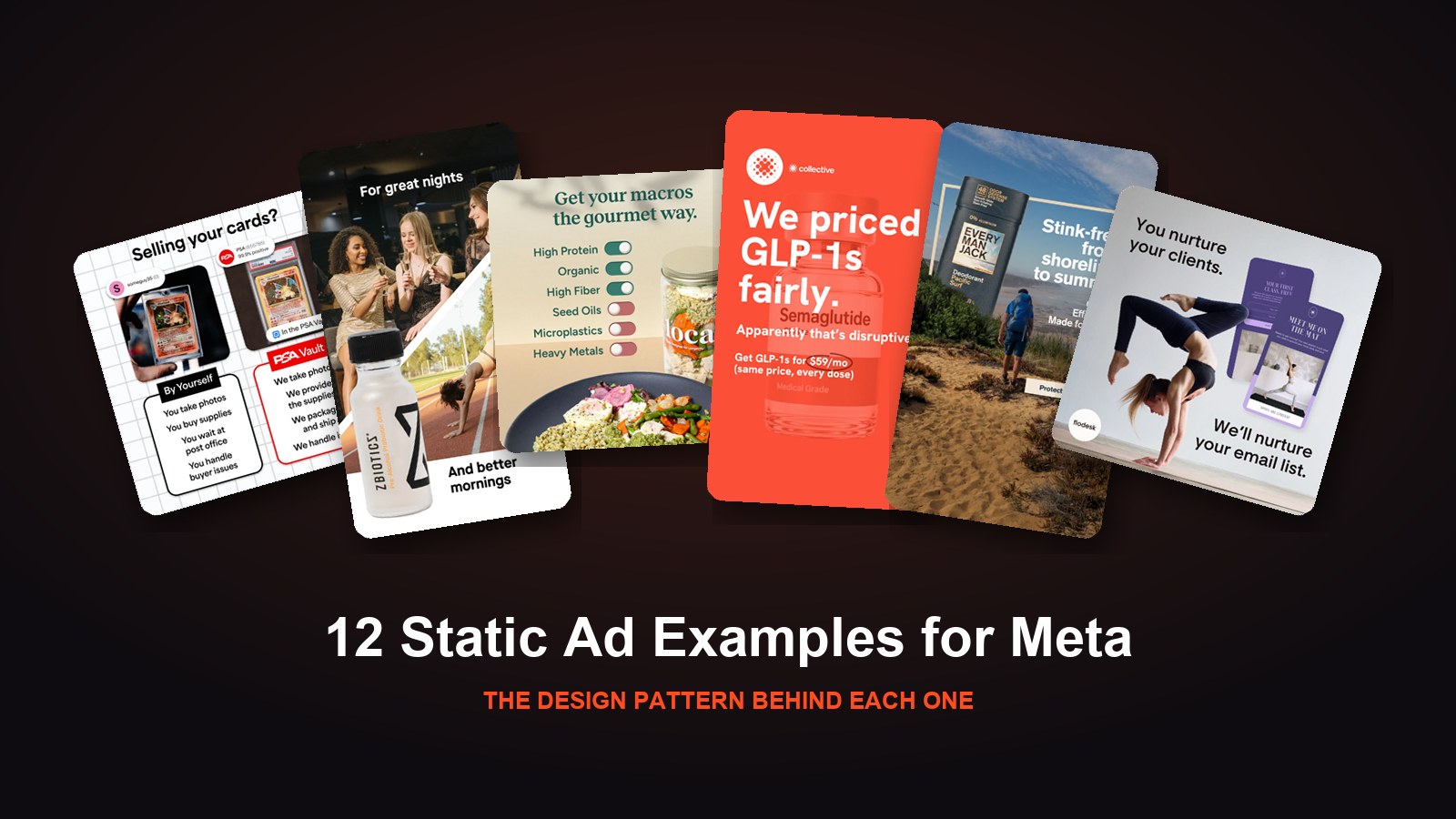
Here are 12 static ads we've made for brands on Meta, grouped by the pattern each one uses.
1. The Split Scene: ZBiotics
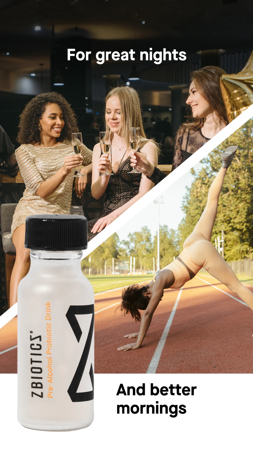
A diagonal line splits the frame in two. On top, friends toast champagne under "For great nights." Below, a woman does a dancer's stretch on a running track under "And better mornings." The ZBiotics bottle sits across both halves, holding the story together.
A split scene tells a before-and-after story without a single claim. The product is literally the bridge between the two moments, so you understand what it's for in one look.
2. The Parallel Headline: Flodesk
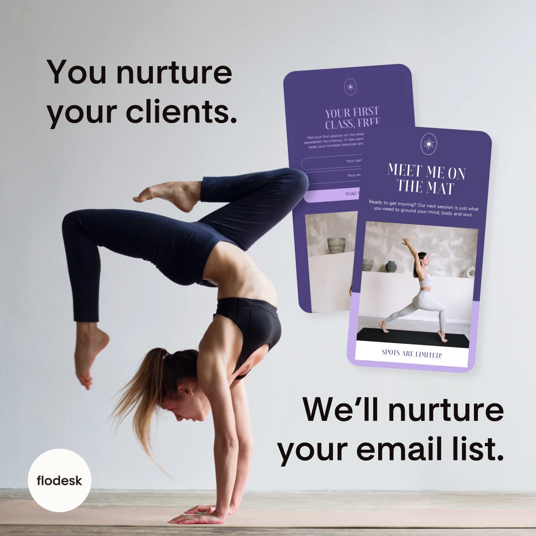
"You nurture your clients. We'll nurture your email list." A yoga instructor holds a handstand while two of her email designs float beside her: a free first class offer and a "Meet me on the mat" newsletter.
For a SaaS product, showing the actual output beats describing features. Pairing it with a line that mirrors the customer's own job makes the ad feel written for one specific person: here, a fitness instructor who'd rather be teaching than building emails. For more on selling software with creative, see how to advertise an app or SaaS product on Meta.
3. The Problem-Question Hook: For Wellness
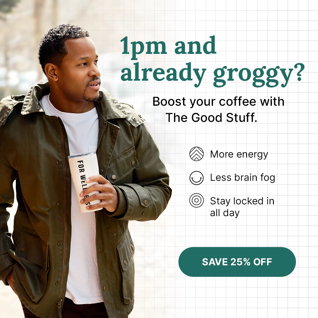
"1pm and already groggy?" This ad for The Good Stuff, For Wellness's coffee booster, shows a man walking with a tumbler in hand, next to three simple benefit icons: "More energy," "Less brain fog" and "Stay locked in all day." A "Save 25% off" button sits at the bottom.
Opening with a specific moment, not a product name, lets the right person recognize themselves instantly. The icon list and the offer button then do the rest: benefit, proof, action.
4. The Oversized Product: Every Man Jack
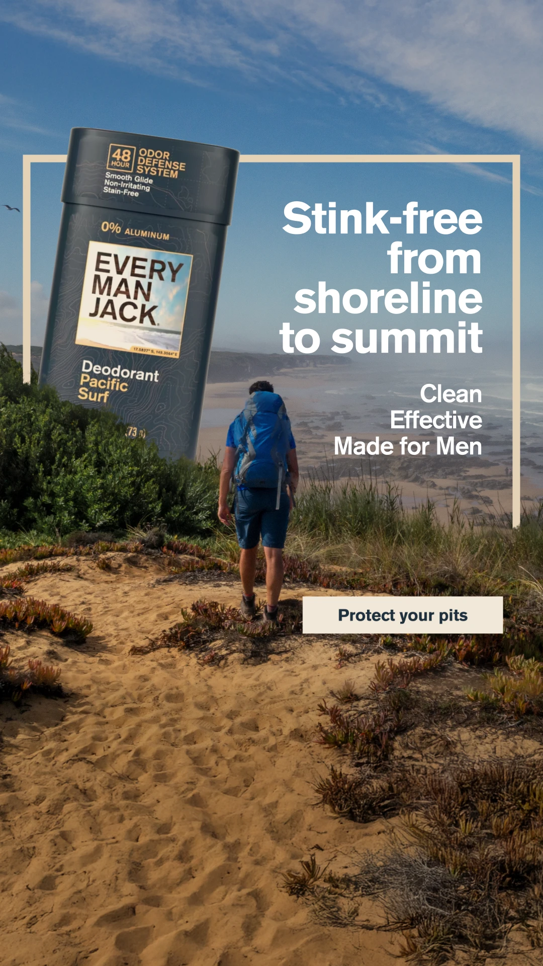
A giant Every Man Jack deodorant stick towers over a coastal trail as a hiker heads toward the ocean. "Stink-free from shoreline to summit," then "Clean, Effective, Made for Men," with a "Protect your pits" button.
Scaling the product up to landmark size is a simple visual trick that stops the scroll and keeps the product as the hero. The outdoor setting does the positioning work: this is deodorant for people who actually sweat.
5. The Toggle Checklist: Locale
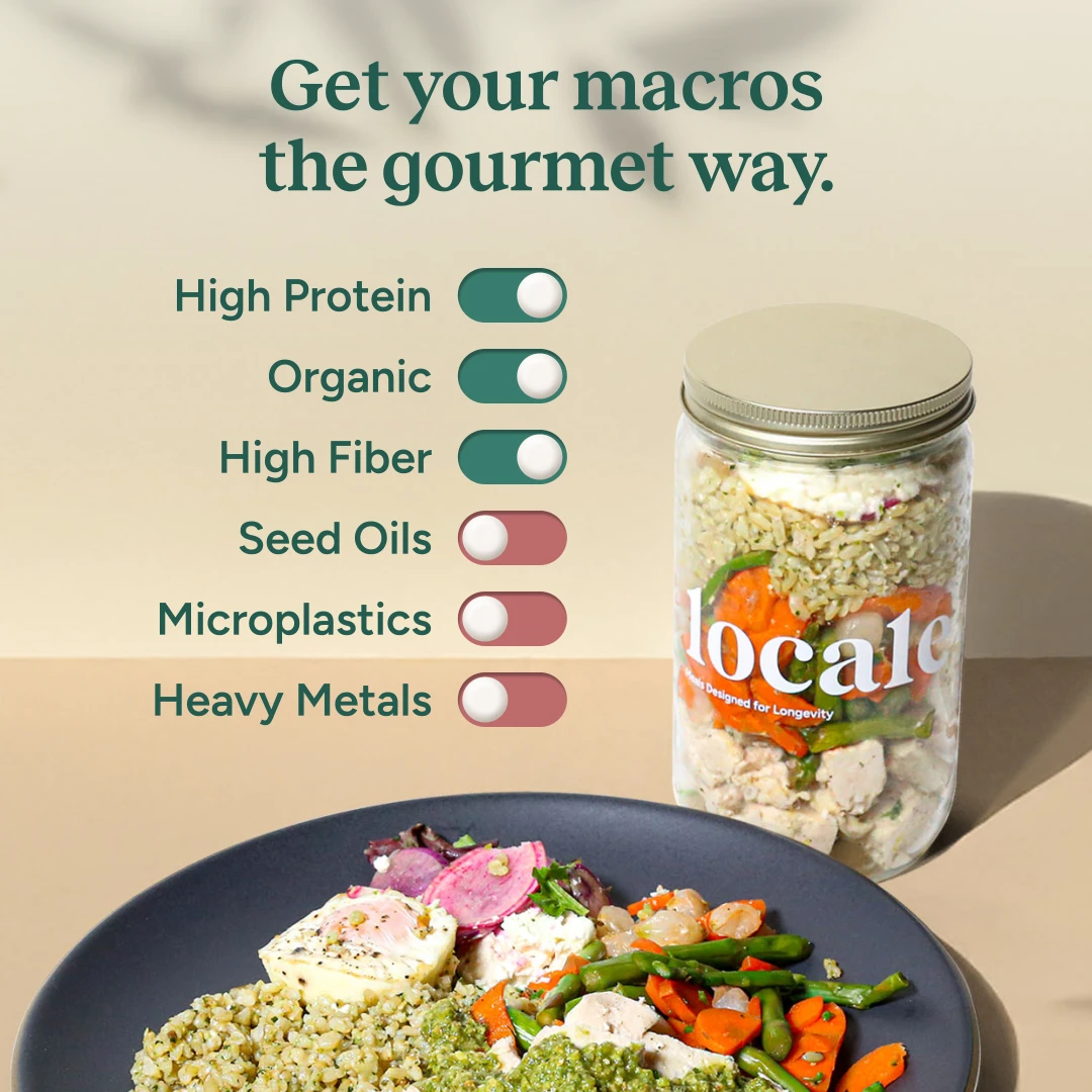
"Get your macros the gourmet way." Next to a Locale meal jar, a column of phone-style switches is turned on for "High Protein," "Organic" and "High Fiber," and turned off for "Seed Oils," "Microplastics" and "Heavy Metals."
Borrowing a UI element everyone recognizes makes a list of claims feel quick and scannable. Showing what's not in the product, in red, speaks directly to health-focused shoppers who read labels.
6. The Us vs. Them Comparison: PSA Vault
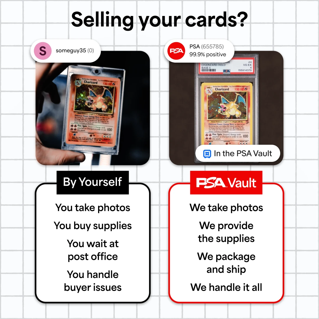
"Selling your cards?" On the left, "By Yourself": a Charizard card from "someguy35 (0)," with four chores underneath: take photos, buy supplies, wait at the post office, handle buyer issues. On the right, "PSA Vault": the same card graded, from a seller at "99.9% positive," where PSA handles all four.
Comparison layouts work because shoppers are already weighing their options. The seller badges are a smart detail: they borrow the look of a marketplace listing to show trust without saying the word.
7. The Big Bold Stat Stack: Awesome Everyday
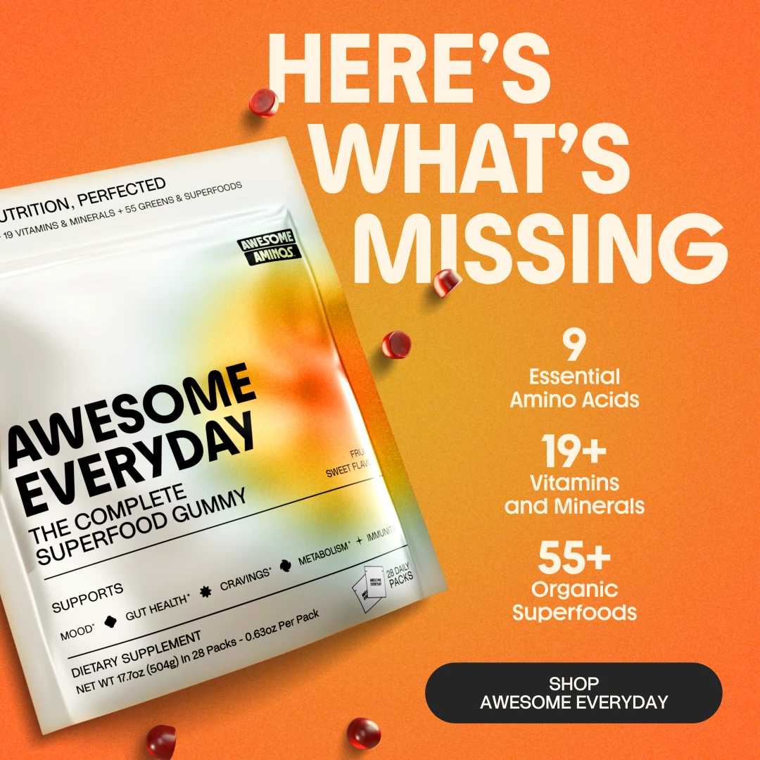
"Here's what's missing," in huge type across a bright orange background. The Awesome Everyday gummy pouch sits at an angle while three stats stack down the side: "9 Essential Amino Acids," "19+ Vitamins and Minerals" and "55+ Organic Superfoods."
When a product's selling point is completeness, numbers make it concrete. The loud color and oversized headline make sure the ad gets seen before anyone reads a word.
8. The Promise and the Proof: SeroVital Hair Regeneres
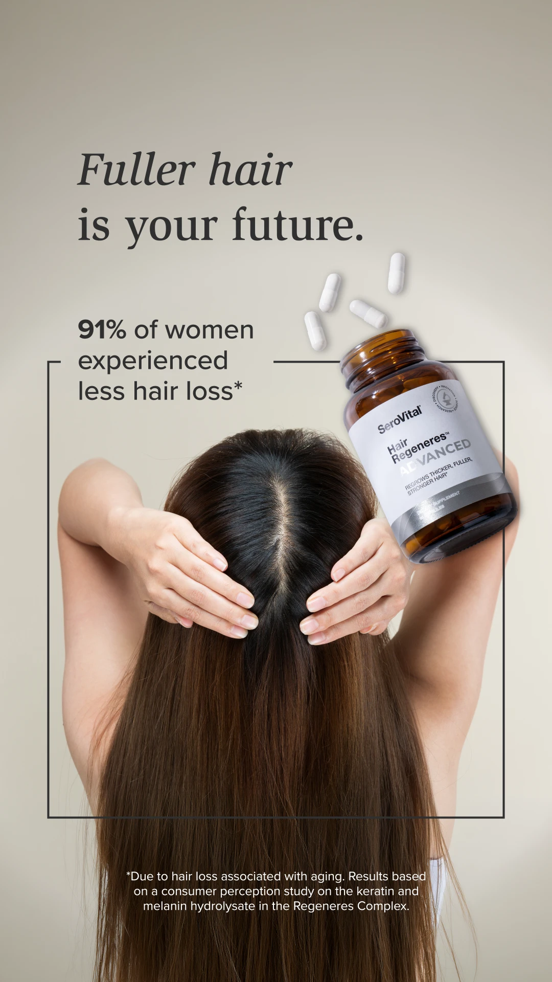
"Fuller hair is your future." A woman holds her long hair at the part while a bottle of SeroVital Hair Regeneres Advanced tips over and spills capsules. A framed callout adds the proof: "91% of women experienced less hair loss*," with the study details in the footnote.
The headline makes the emotional promise and the stat backs it up. For supplements, that pairing matters, and so does the footnote. A specific, sourced number is more convincing and safer than a vague claim.
9. The Annotated Product: SeroVital
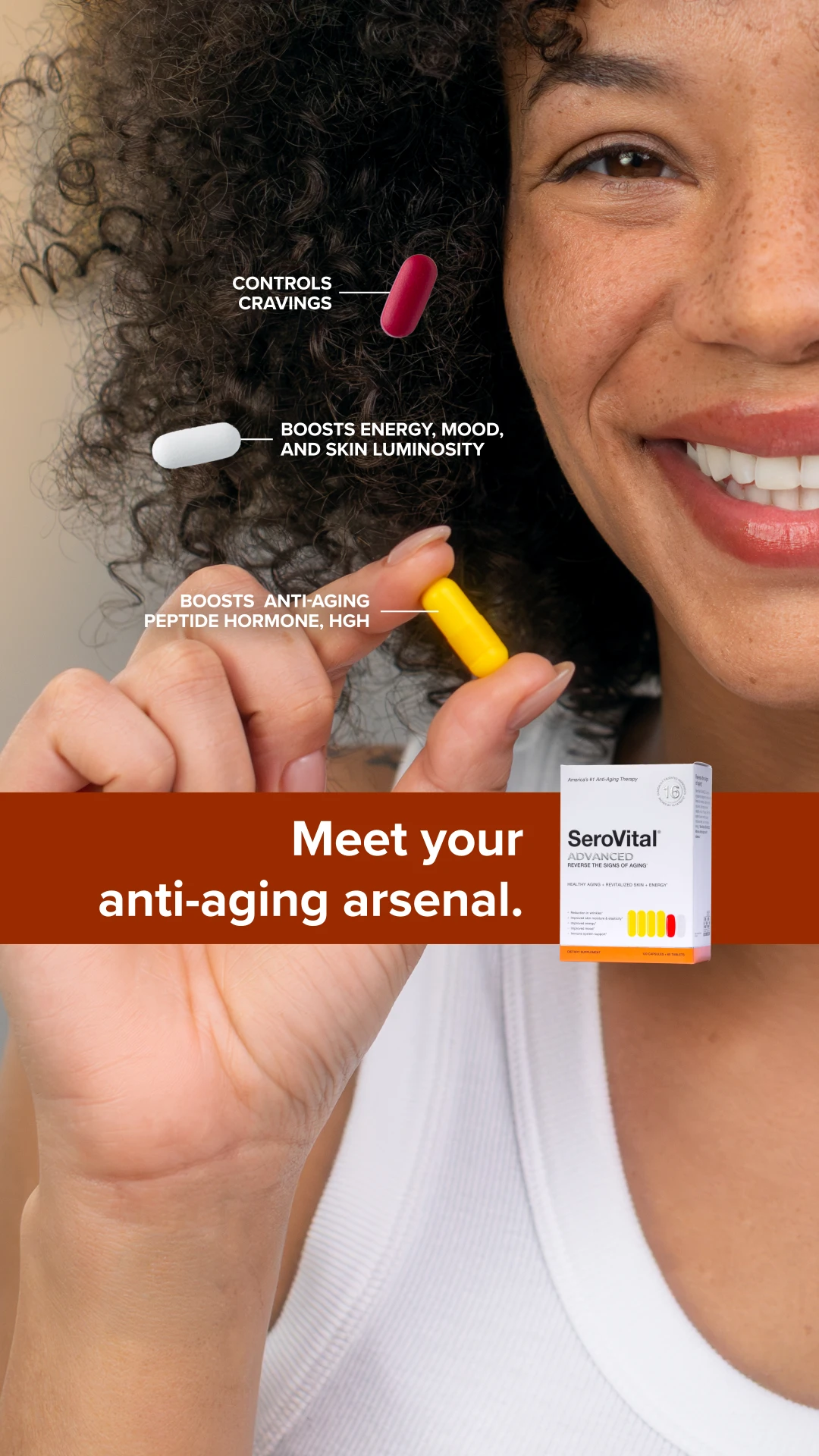
A smiling woman holds up a capsule while small callouts point to each pill's benefit: "Controls cravings," "Boosts energy, mood, and skin luminosity" and "Boosts anti-aging peptide hormone, HGH." A banner reads "Meet your anti-aging arsenal."
Callout lines turn a product shot into a quick explainer. It's the static version of a product demo: the viewer's eye follows the lines, and each one teaches them something.
10. The Price-Forward Headline: Collective
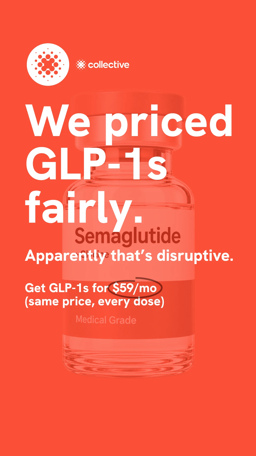
"We priced GLP-1s fairly. Apparently that's disruptive." A faded semaglutide vial sits behind the text, and the offer lands with the price circled: "Get GLP-1s for $59/mo (same price, every dose)."
In a category where price is the biggest question, leading with it is the hook. The wry second line gives the brand a personality and makes a price point feel like a stance.
11. The Photo Grid: Wilderdog

Four dogs in four landscapes, from desert to mountains to forest, all wearing Wilderdog harnesses. The product floats at the center, framed by "The softest harness that hugs them back."
A grid shows range: many dogs, many colors, many adventures, in one image. It also feels like a customer photo wall, which quietly signals that lots of people use and love the product.
12. The Editorial Lifestyle Shot: Sundays for Dogs
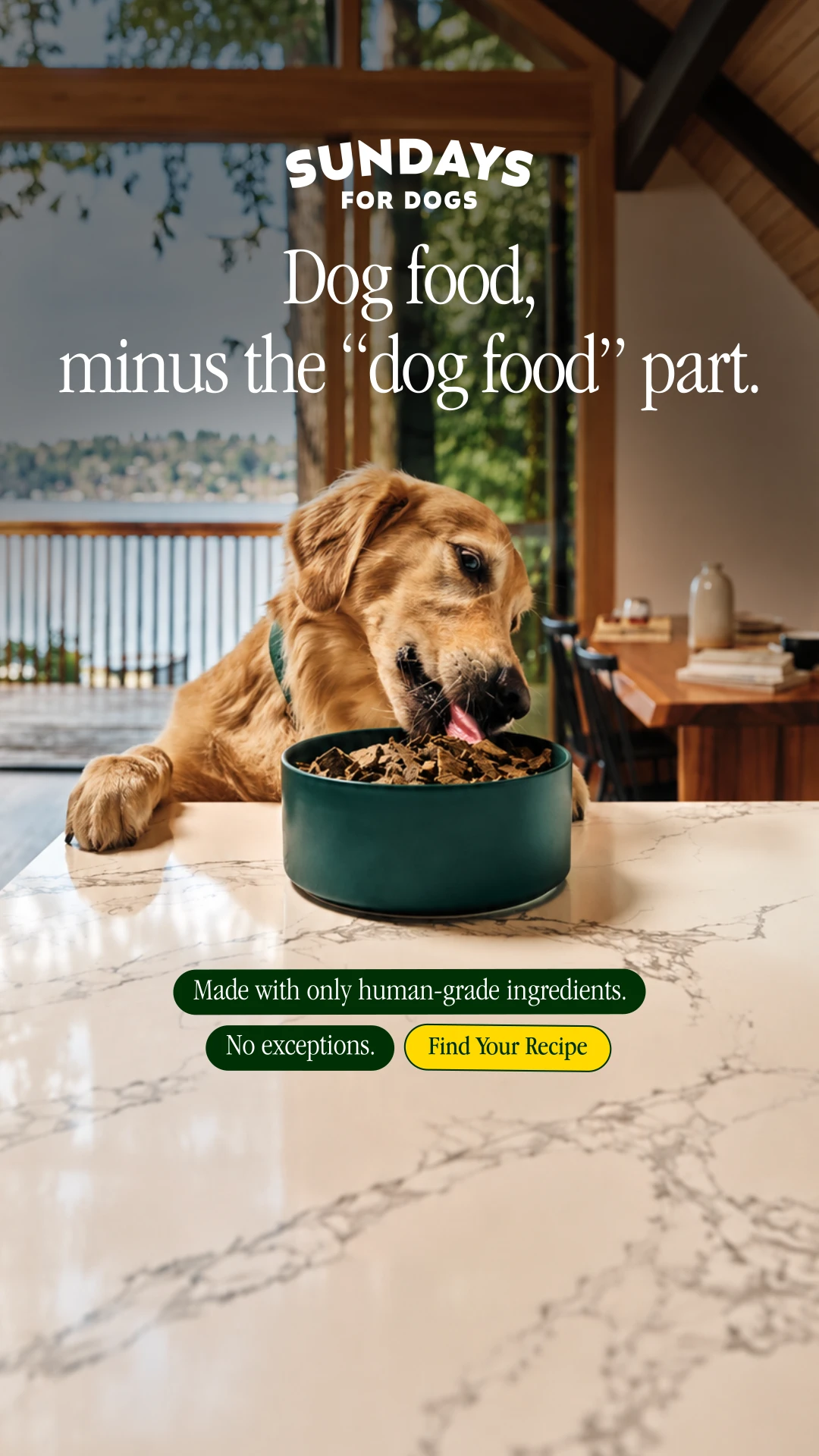
A golden retriever eats from a bowl on a marble kitchen counter in a bright, modern home. "Dog food, minus the 'dog food' part." Small tags read "Made with only human-grade ingredients. No exceptions." and "Find Your Recipe."
Shooting dog food like a food magazine spread is the whole message: this is food you'd feel good about serving. The headline's wink makes it memorable, and the setting does the premium positioning.
What Makes a Static Ad Work
- One idea per image. Each ad above makes a single point, whether that's a split before-and-after, a comparison or a stat. Statics that try to say everything end up saying nothing.
- The headline does the hooking. "1pm and already groggy?" and "Selling your cards?" call out the right person in two seconds.
- Borrow visuals people already understand. Toggle switches, seller ratings, callout lines and photo grids feel familiar, so they're read instantly.
- Proof belongs in the frame. Stats, ingredient lists and comparisons give a static the credibility a video would build over 30 seconds.
- Make lots of them. Statics are the fastest format to produce, so they're the easiest way to test new angles and give Meta more creative to work with.
Statics work best as part of a mix. See our UGC ad examples, UGC hybrid ads and GIF-style moving stills for the formats they run alongside.
Work With the Team Behind These Ads
Biddyco is a static ad agency for brands spending $100K–$5M+/month on Meta. Our in-house team makes statics, motion and UGC on a flat monthly retainer, built for the creative volume and diversity it takes to scale.