Social proof isn't one thing. It's scarcity, it's reviews, it's press, it's a founder quote, it's a wall of comments, it's a stranger on the internet saying the thing you were too biased to say about your own product. The ads in this post all lean on that same basic truth: people trust other people more than they trust you, and the best creative finds a way to let someone else do the talking.
Here are 11 ways we've built press and social proof directly into the creative, not just left as a testimonials page nobody visits.
1. The Social Proof Stack
This one's the clearest thesis for the whole post. In a single 19-second ad, we stacked four different proof points on top of each other: faux notifications showing real-time activity, a subscriber counter ticking up, a cascading list of press logos, and UGC clips of real customers. None of these on their own is a complete ad. Together, they compound.
The lesson isn't to cram everything into every ad. It's that social proof isn't a single slide, it's a toolkit, and the strongest ads often pull from more than one piece of it.
2. The Social Proof Trifecta
There are three real pillars of social proof: scarcity (is it hard to get), reviews (how many people are raving), and press (do publications vouch for it). This ad hits all three in under 12 seconds.
Most customers don't want to be the first person to try something new. If you genuinely have something to say for each of these three pillars, this format is worth testing before you build anything more complicated.
3. Press-Hit Tiles, Edited for Momentum
A single press screenshot works. A wall of them, cut together fast, works differently: it's less about any one publication and more about the feeling of "everyone is talking about this." Showing press hits blocked into multiple tiles on one frame, then flying through them quickly, builds momentum rather than credibility alone.
This is worth reaching for when you have volume, five or more mentions, rather than one flagship hit worth lingering on.
4. The Press Screengrab, with Video Layered On Top
A straightforward but underused move: screengrab the actual article (Vogue, in this case) and overlay a video on top of it to make it stand out further in the feed. A well-known outlet helps, but the format holds up with smaller publications too.
If you have more than one press mention, build a version of this for each and let performance tell you which one to scale.
5. The Faux Press Ad
Press-style ads work, but they require a recognizable publication to have written something flattering, which not every brand has yet. The workaround: build an ad formatted to look like an article anyway. You lose the cachet of an actual logo at the top, but you gain full control over the headline and copy.
Don't wait on press coverage you don't have yet. Borrow the format, write the headline you wish a journalist had written.
6. The Magazine-Style Advertorial
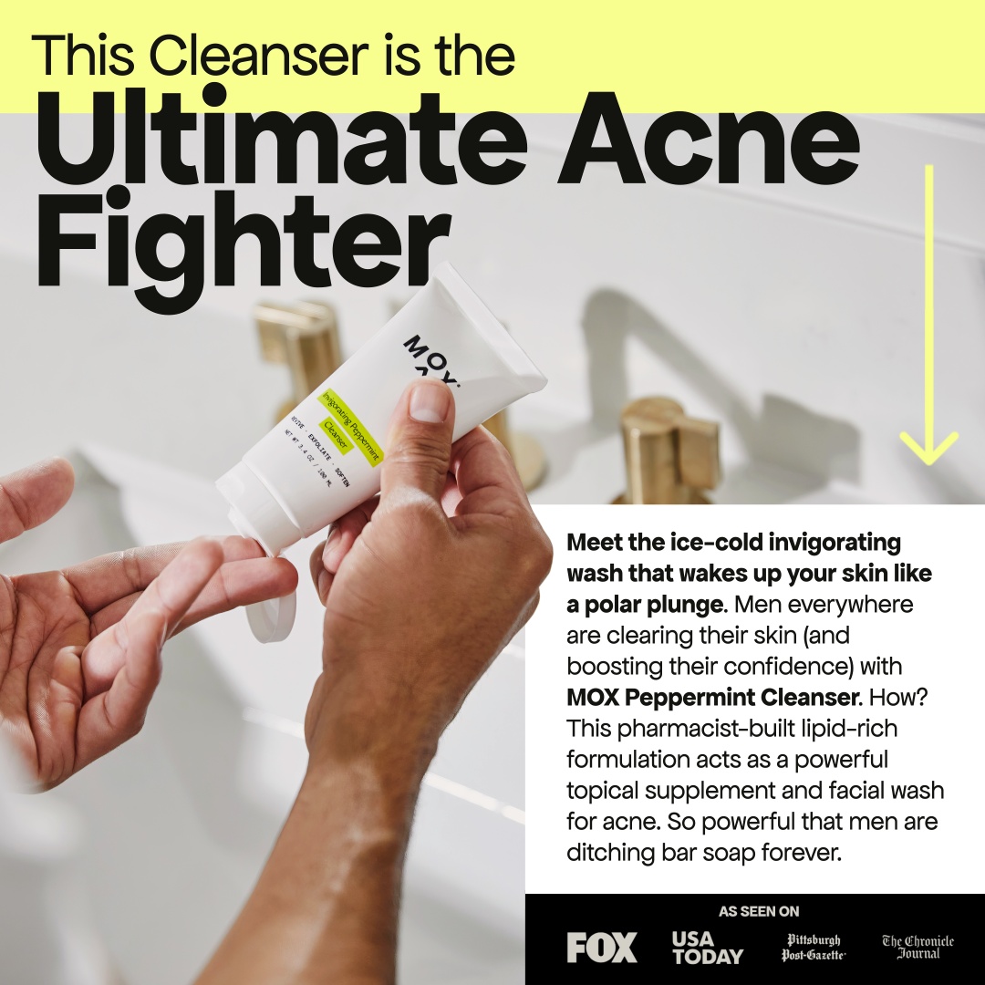
Styled to mimic an old print ad or magazine spread: a big, clear headline, the product shown in packaging and in use, a few sentences of descriptive copy, and a handful of press logos for social proof. It reads as editorial before it reads as an ad, which is exactly the point.
7. Press Hits, Grouped by Theme
Even when a single press hit doesn't drive much revenue on its own, the logo or quote is valuable inside an ad. If you have more than a couple of mentions to work with, don't just list them randomly, group them around a theme (in this case, all things napping-related) so they reinforce one idea instead of scattering attention.
8. Specific Testimonials Beat Generic Ones
The format here is simple: a testimonial over an on-brand visual. What makes it work is which testimonial gets picked. "I'm a super picky tea drinker..." reads as believable in a way "it's so good, I love it" never will. Specificity is what makes a testimonial feel real instead of staged.
Before you pick a review to feature, ask whether it sounds like something a real, particular person would say, not a five-star rating with no texture.
9. A Testimonial That Pre-Answers the Objection
Scent is nearly impossible to sell visually, and the obvious worry with any strong-smelling product is that it'll be overpowering. Rather than avoid that concern, this ad names it directly, then answers it with a testimonial built specifically to squash it.
If your product has a predictable objection, don't hope viewers won't think of it. Get ahead of it with proof that directly answers the doubt.
10. The Review Bombardment Opener
Some products are genuinely hard to sell through a screen (scent again, in this case). The workaround: open with an overwhelming volume of reviews stacking up on screen, so many that they eventually cover the product entirely.
Nobody's meant to read every word. The effect is the point: "that many people can't all be wrong."
11. Fill-in-the-Blank Pain Points, Closed Out with a Press Quote
A broad opening question sets up an umbrella problem, then a rapid-fire fill-in-the-blank format runs through the specific pain points underneath it. Not every viewer will relate to every one, but stacking several increases the odds that at least one lands. The ad closes with a strong press quote for third-party credibility.
The founder of Awkward Essentials, Frances Tung, put it this way after working with us: "We were unsure if Biddyco could execute on our brand voice because we have such a distinct personality. But they've done an incredible job with the copy and visuals. After just the first month we hit a 2x ROAS."
Borrowed Credibility, Built On Purpose
None of these ads are asking the viewer to trust the brand. They're all finding a faster, more credible messenger, a customer, a journalist, a raw number, a crowd, and getting out of the way. That's the actual skill here: knowing which kind of proof fits your product, and building an ad structured to let it do the convincing.
Social proof is just one lever in the mix, pair it with the animation and motion techniques we use elsewhere to stop the scroll. And if you're currently evaluating who should build this kind of range for your account, here's what to actually look for when hiring a Meta ad creative agency.
If you've got press hits or reviews sitting unused, or you're not sure which type of social proof would move the needle for your account, that's exactly the kind of creative work we do as a creative agency for Meta ads, for brands spending $100k-$5M+/month.