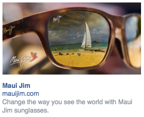
Above is an ad for Maui Jim sunglasses. As you might be able to tell from the name, the sunglasses are from Hawaii and that is very infused in the branding.
Let’s take a look at what it does well and how it could improve.
Retargeting: I saw this ad a few days after I went to their website so my best guess is that this is a retargeting ad. It’s always surprising to me how many companies are not using retargeting. So +2 points for just doing that.
The image shows the beach and a sailboat which reflects their brand well. And the fact that a lot of people will be buying Maui Jim’s for use on their next vacation or for the summer in general is another match with their target customer’s behavior.
However with all that being said, I do think that the image could be stronger.
But we’ll dive into that in a second.
Now, let’s look at what could possibly be improved.
Headline: The current headline says “Maui Jim.” This is extremely important to remember, your headline should be more than your company name. It should provide benefits. It should provide a reason why people should care. It should give people a damn good reason to click.
Keeping it as is, this ad could be run by any sunglasses company by simply changing the company name and image.
But Maui Jim is not like every other sunglasses company. They have patented lens technology to create brilliant color and crisper details.
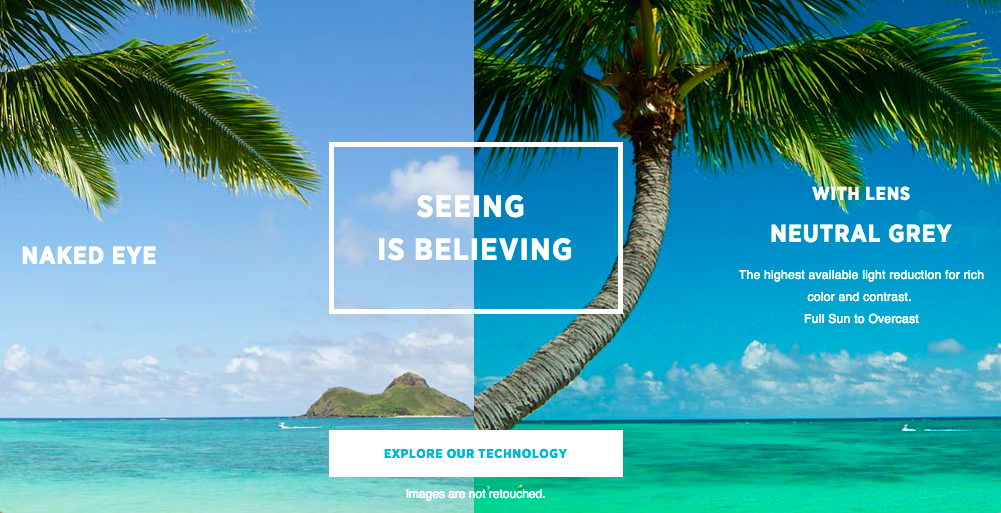
They have a very cool section on their site that shows what landscapes look like with the naked eye and what they look like while wearing a pair of Maui Jims. The scene shown while wearing their sunglasses has more contrast and better colors.
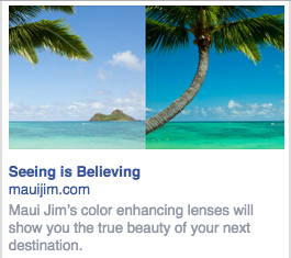
This should be the image for their ad. A split screen showing the difference.
They already have a good headline on their site: “Seeing is believing”
Then the body copy could highlight how much better your vacation could be while wearing a pair of Maui Jims.
“Maui Jim’s color enhancing lenses will show you the true beauty of your next destination.”
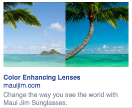
They could even leave the original body copy as is and improve it by swapping out the photo and changing the headline to:
“Color Enhancing Lenses”
or
“Change the way you see the world with Maui Jim Sunglasses”
This anchors the original body copy and now makes sense.
So to roundup what we covered:
- Your headline needs to speak to your customer and give them a good reason to click on it.
- Just because an image matches your branding doesn’t mean it’s the right choice. If you can convey what makes your product, business, service unique in an image, ALWAYS use that one.
- Body copy should compliment the headline, and it’s wise to have the body copy outline the emotional benefit your customer could receive from buying your product or service.
Take this and implement it in your own campaigns (or have us do it for you) and then go grab a pair of new sunglasses for summer.
