Creative That Converts
Reviews
Every month, we spend millions of dollars testing hundreds of ads. We’ve found that highlighting customer reviews can be super powerful for increasing performance.
Customer testimonials/reviews are crucial for bridging the gap between browsing and buying. They heavily influence how much a prospective customer will trust your product by providing credibility and social proof. If your customers are loving your products and leaving great reviews, don’t be afraid to showcase them on your ads.
Take a look below to get some insights for your own campaigns!
Magic Spoon
This ad we created for Magic Spoon is a great example of review bombardment to showcase all of your great reviews.
Our goal for this ad isn’t for people to be able to read every review. As you watch it, you might be thinking “Oh it’s too fast, I can’t read them.” Our real goal is to sweep you away by the volume.
As the ad scrolls, your brain will catch standout words like obsessed, amazing, loved. This is the format to pick short reviews with sweeping statements. “the best”, “my fav”, “I love”, etc. etc. And then at the end, make sure you close the loop by showing how many total reviews there are. In Magic Spoons case, 17,000.
Taste the cereal that 17,000 people are raving about from magicspoon.com.
Blume
This ad we made for Blume is a great example on how to use a review count ticker combined with a website scroll. We did this for 3 of their main sellers in one ad, but you could easily do it for just 1 product.
On the left, we have a screen recording of the reviews section of one of their product pages. On the right, a dynamic review count ticker with a testimonial. AND in the middle, we have a PNG cutout of the product itself.
Social proof works, and in this 15-second concept, we weave it in 3 different ways: (1) The plethora of reviews on the left; (2) The impressive number of 5-star reviews ticking upwards; and (3) The highlighted testimonials.
If you’re looking to switch up your self care routine, check out blume.com.
Bonafide
This ad we made for Bonafide is a great example on how to highlight positive customer comments. Any brand can use this. Use a short copy line that will jump out to the right people, and then continue to hold their attention with an interesting transition.
We open with a simple frame, plain text that calls out to our target: “Men can keep their little blue pill.” And then almost immediately, a pattern transition occurs full of, well, little blue pills.
The next section at 4 seconds is yet another way to highlight positive customer comments. These could be taken from actual IG comments, snippets from site reviews, or could even be compliments sent in to your customer support team.
And the final 🤌 touch is the swipe-up transition to the end card, which is a subtle nod to the action we want the viewer to take next.
Want to increase your libido? Pick up a bottle of Ristela from hellobonafide.com.
Healthybaby
This ad from Healthybaby (previously Healthynest) is a great example of how to use customer testimonials to overcome pain points. Alleviating pressure points is an effective way to motivate a customer to buy.
Using reviews to overcome objections and address common questions is an A+ strategy for increasing trust. I’m a broken record at this point when it comes to the importance of establishing trust, but I hope it’s starting to sink in. Customer testimonials/reviews are crucial for bridging the gap between browsing and buying.
Happy customers have already had their pain points satisfied, questions answered, and doubts alleviated. Allow their experience to speak for you. Their words hold more weight anyways!
Pick up a pack of all-natural diapers here: healthybaby.com
JOIN OUR DAILY EMAIL LIST TO SEE EVEN MORE CREATIVE
Zitsticka
(not our client)

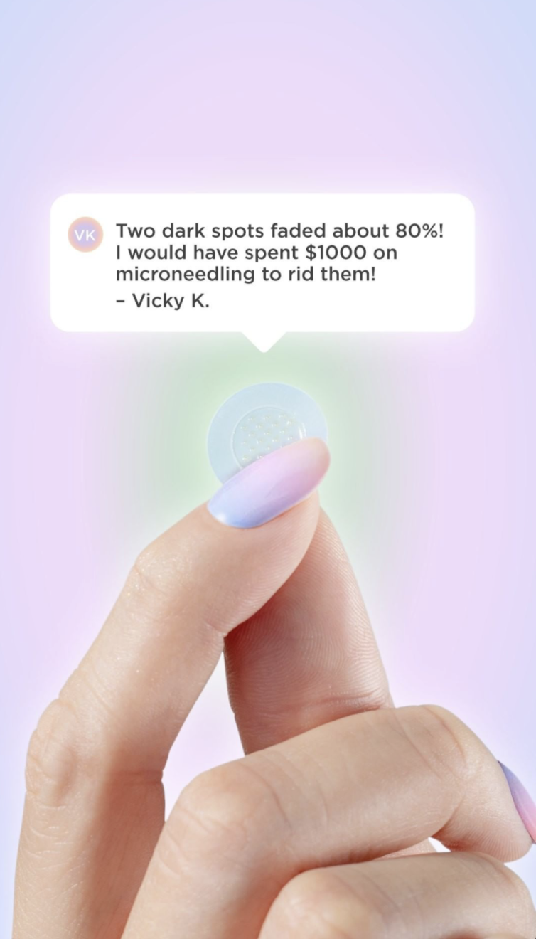
Zitsticka took a review, meshed it with a more native-looking format (chat bubble) and then slapped it on top of a super clear product closeup that’s being used within context (being held by a hand). If you have a great review you can make this ad.
The chat bubble can be recreated in multiple iterations:
- cartoonish
- animated as popping into the frame
- appear like an Instagram comment or like a ‘tagged’ iInstagramgraphic.
And we’ve talked about this before, but notice the little ‘profile pic’ emblem. That’s not Vicky’s profile pic, but it creates familiarity for the format. So if you DO decide to go for a more native look, don’t forget that profile pic.
The product closeup can be on a lifestyle image that’s cropped in and has a more subdued background, or take a product SKU and mount in on a colorful background like they did here. Just make sure that there’s nothing else in the frame that’s going to compete with the review.
And when picking a review, know that we’ve seen specific and more sensational-sounding quotes work best. Skip over the bland/nice reviews that sound like, “I love these dark spot stickers so much. They’ve really helped fade my dark spots.” Those aren’t the kind of reviews that help convince a customer to checkout.
Are you breaking out? Try a pimple patch from zitsticka.com.
Native
(not our client)

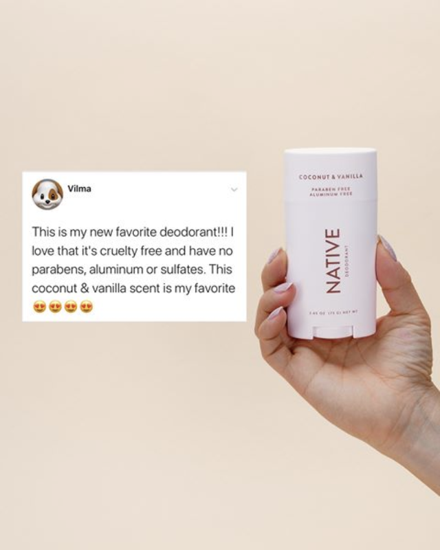
Native did a great job on this review ad that mimics the look and feel for a specific social platform. This is an ad that just about everybody can create. If you have a review and an image of your product, you’re in business.
We’ve found over the years that the more specific or fun the review is, the better the performance. I wouldn’t say the review they used is one that we would have picked, but you get the idea. Oftentimes, we see humor can really make a difference, or when someone gets into the nitty-gritty of a product’s benefits. Honestly, it would be worth testing in your campaigns to see if your audiences respond better to more wholistic/pleasant reviews (like in the Native ad here) OR if reviews that have a bit more zest capture more.
Lastly, put a profile pic. If you can get permissions to use a photo from the actual reviewer (don’t go to great lengths for this, only if you already have that function baked into your review software), awesome. If not, go to a free stock photo site and grab the back of a woman’s head, or a different obscure photo that could pass as a profile pic. It gives it even more of a ‘native-looking’ feel!
Pick up Vilma’s favorite deodorant from nativecos.com.
Prose
(not our client)
This ad concept from Prose is another different way to highlight reviews.
The 5-stars at the top of the visual holds as the anchor throughout the ad, while the reviews themselves slide in and out. It’s a small thing, but it adds gravity to the reviews vs. if they were just text without the ⭐️⭐️⭐️⭐️⭐️.
The other thing they do well is picking reviews that touch on different aspects of the product. One talks about smell; one is from a professional hairstylist, so hits on credibility; and the other hits on how it makes your hair soft.
Don’t just pick the first 4 reviews on your product page. Strategically vary the benefits or features that your reviews touch on. The more detailed, the better. The least engaging review is one that doesn’t tell you much -> “I LOVE IT. Will absolutely be buying again. Totally recommend if you’re looking for something new.” vs. “This shampoo totally transformed the texture of my hair. It’s never been silkier.”
When trying to pick reviews to feature in ads, the best question to ask yourself is… “Is this compelling enough to make me curious about the product?
Transform your hair with personalized care from prose.com.
STILL CURIOUS?
We thought this was a fun way to show off some of the cool stuff our creative department is doing without giving away the full strategy secrets. So while I’ve drastically simplified the intention and strategy behind each asset above, I hope these were still entertaining (and maybe even a bit inspiring?) to play through.
If you would like to see more ad examples like the ones above, subscribe to our daily email list to receive ideas to inspire your creative every weekday:
JOIN OUR DAILY EMAIL LIST TO SEE EVEN MORE CREATIVE
