We’re back with another Adcheck. It’s an ongoing series where we present the good and the bad of a Twitter ad and then analyze how to make it better. You can see some of our past Adchecks here, but let’s get to Brooklyn Boot.
A key foundation of any campaign is having congruency between the ad and the landing page.
If they land on a page and see what they expect, conversions are higher. Which makes sense.
In the below ad and landing page, however, we have total incongruence. This leads to confusion and slashes conversions drastically.
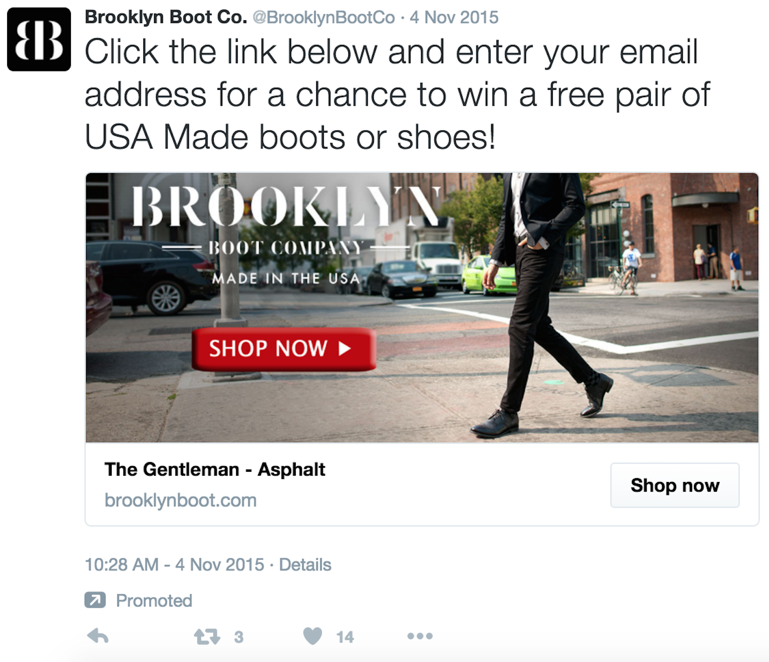
In this ad, look at the copy. It’s talking about entering a contest. That’s a good strategy. Nothing wrong with that.
But look at the image below the copy. The CTA is ‘Shop Now’.
So we have the call to action of entering a contest, but also Shop Now.
There can only be one!

An ad should have one and only one call to action. Having more than one will lead viewers to move on, ultimately taking zero action.
Let’s also look at the headline: ‘The Gentleman – Asphalt’. I’m guessing that’s the name of one of their products, but it has nothing to do with this ad. It does nothing to support the contest or to even make the ad more interesting. Nobody has any idea what ‘The Gentleman’ is.
The headline should point to the purpose of the ad (the contest.) Something like “Win a free pair of boots!” would be more effective.
Now let’s look at the landing page we’re sent to after clicking on the ad.
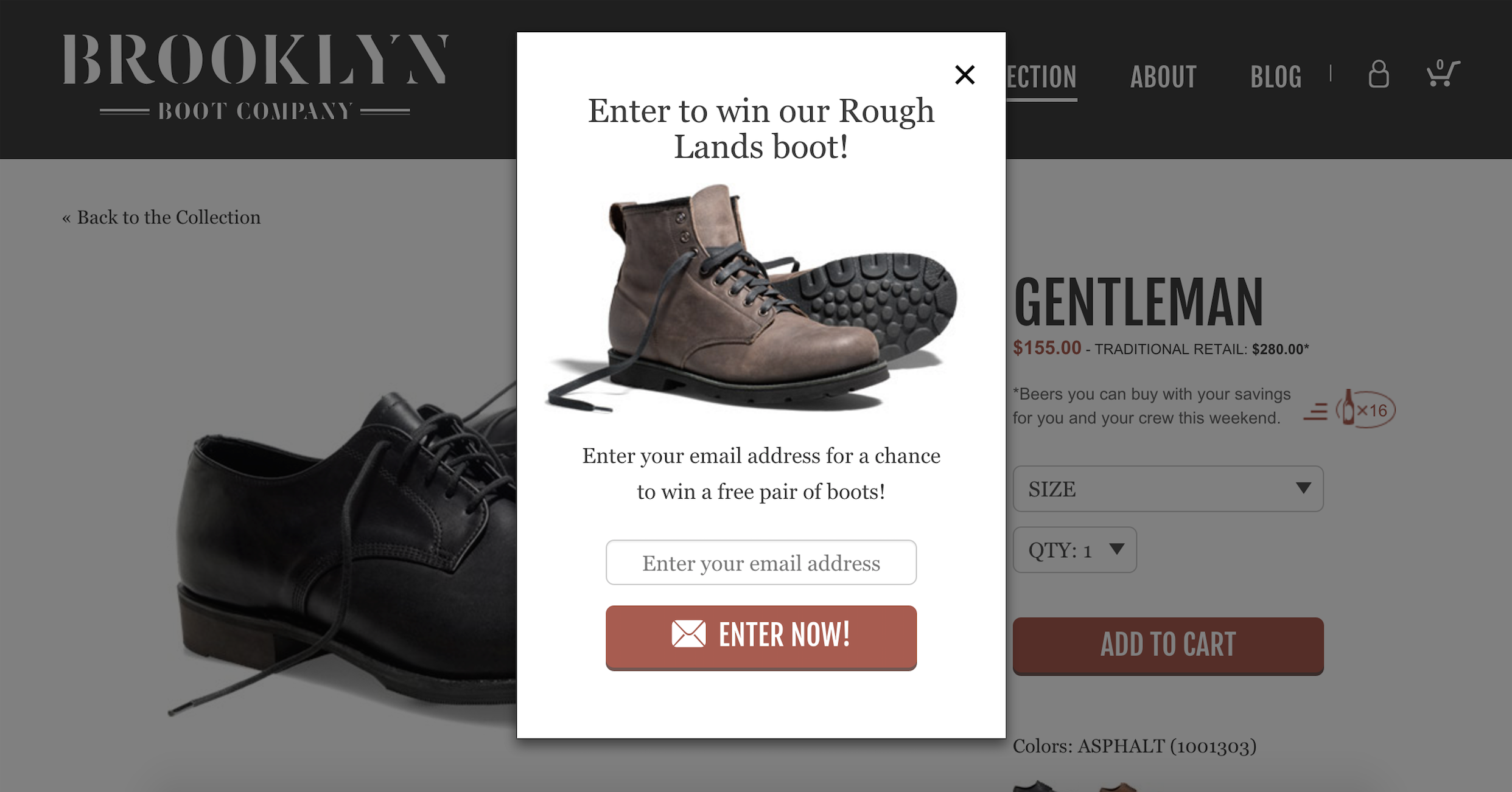
Does the offer match the intention?
The page is for their ‘The Gentleman’ shoe, but I’m getting a popup to enter the contest to win a completely different product – the Rough Lands boot.
If I clicked on an ad with an image of a guy wearing shoes, I’m probably not in the market for boots. So this popup is going to convert very poorly.
Instead, they should be exclusively featuring the shoes that were pictured in the ad so that there is alignment between my interest and the original offer.
#1 mistake most brands make
Lastly, there is one other problem with this popup. And we see brands running contests make this mistake all of the time.
The details about the giveaway are so vague that they leave doubt and confusion in the visitors mind.
Doubt and confusion will almost always lead a customer to jump ship.
How often are the boots given away? Once a year? Once a week?
We have no idea.
How many winners are there? Two every week? One a month?
I want to know what my chances are!
How do I win? Is it random?
They could increase the conversion rate of this popup tenfold by including this below the ‘Enter Now’ button:
“A winner is randomly selected from our email list once per month.”
Takeaways
– There can only be one call to action. Pick it and stick with it.
– Align the interest that you are creating and the offer you are serving.
– Vague details = doubt, which leads to lost conversions.
With just a few small tweaks to their ad and landing page, Brooklyn Boot could likely see a much higher ROI with this campaign.