Advertising a physical product on Meta has one big advantage: you can show it. Someone picks up the bottle, opens the box, takes a bite, and the viewer gets it in a second. Apps, software and financial products don't have that. The product lives on a screen, the benefit shows up after someone signs up, and you're asking a stranger to trust you with their data, their money or their time before they've seen any of it work.
That's why so many app and SaaS ads on Facebook and Instagram fall back on a screen recording and a feature list. It's the most literal way to show the product, and it's usually the least persuasive. The ads that work do something smarter. They show the outcome instead of the interface, put a real person in front of the product, or turn an abstract promise into something you can see.
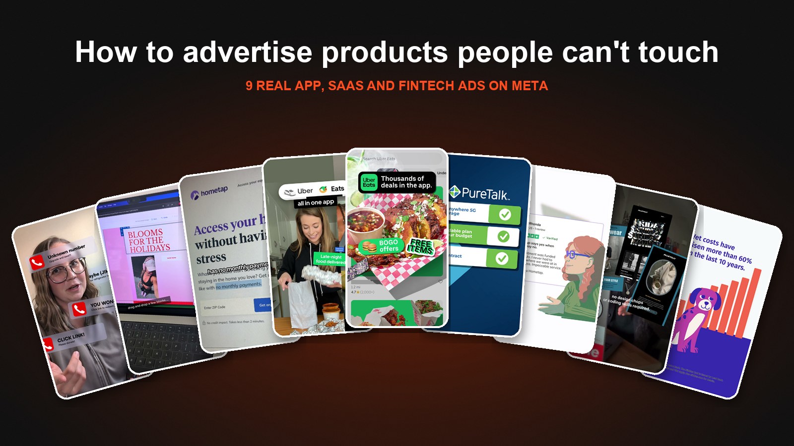
As a tech creative agency, this is the problem we solve every day. Below are 9 real Meta ads we've made for tech, app and fintech brands, grouped by the approach behind each one. Each approach solves a different version of the same problem: how do you advertise something people can't touch?
Why Advertising an App or SaaS Product on Meta Is Different
A few things make tech harder to sell in the feed than a typical consumer product:
- There's nothing to hold. You can't rely on packaging, texture or a taste reaction to do the work. Every visual has to be designed.
- The value is delayed. Most of the payoff happens after the download, the trial or the first month. The ad has to make that future feel real now.
- Trust matters more. Apps ask for data, fintech asks for money, and software asks teams to change how they work. Credibility has to show up in the first few seconds.
- The product changes constantly. New features, pricing and integrations mean creative goes stale faster than it does for a product that hasn't changed in years.
Meta also rewards brands that solve these problems with variety. Meta's Andromeda update favors genuine creative diversity, so an app or SaaS account needs a real mix of formats, like product motion, creator videos and statics, not fifty cuts of the same screen recording. The examples below show what that mix can look like.
Approach 1: Show What Life Looks Like With the App
The simplest way to advertise an app is to skip the interface entirely and show what it does for people.
1. The Split-Screen Use Case Montage
For Uber, the challenge was getting riders to think of Uber for food too, since they can order Eats right from the Uber app. The ad runs a fast montage of creator clips side by side, each with a simple label: "Reliable rides to work," "Late-night food delivered," "Carpool to the game," "Sushi on demand," "Catch your flight," "Coffee comes to you." An "Uber + Eats, all in one app" badge stays pinned at the top the whole time, and it closes on "One app for rides and eats."
No one sees a single screen of the app, and they don't need to. Six quick moments from real life say more about what the app is for than any feature list could. The split screen doubles the pace, so the viewer sees a lot of use cases in 15 seconds.
Approach 2: Make the Interface Exciting
When you do show the product, don't just record the screen. Design around it.
2. The UI Motion Deal Ad
This Uber Eats ad starts on something familiar: a scroll through the app's Offers tab. Then the motion takes over. A food photo peels off the screen like a sticker, a "Thousands of deals in the app" badge lands on top, "BOGO offers" and "FREE ITEMS & MORE" stamps pop in, and it ends on bold kinetic type: "Order Delivery On Uber Eats."
The app UI is recognizable enough to feel real, but the animation makes it feel like an ad worth watching instead of a tutorial. That's the difference between showing an interface and selling one. We go deeper on this kind of work on our motion ad agency page.
Approach 3: Let a Creator Use the Product on Camera
For SaaS especially, the most convincing proof is a real person actually using it. Creators turn a demo into a story.
3. The Timed Challenge Demo
For Constant Contact, the creator opens with a challenge: you think she can't build an email, social and SMS campaign in under 10 minutes? Then she does it. We cut between her talking to camera and the screen as she picks a template, drops in her own images, uses the AI assistant to write copy, turns the email into a social post and sets up a text-to-join welcome message, before scheduling everything.
A time limit turns a software walkthrough into something with stakes. The viewer isn't learning features, they're watching someone race a clock, and by the end they've seen how much the product does without anyone listing it.
4. The "Gift to Yourself" Testimonial
In another Constant Contact ad, a small business owner who runs a streetwear brand opens with a hook: "I got myself the best gift, and it's definitely not what you'd expect." He explains that he's now able to create emails that drive revenue with no design chops or coding skills, while examples of his branded emails and Instagram posts pop up on screen, and closes with "grow your business with a little extra help from Constant Contact."
For B2B software sold to small businesses, the buyer is the user. Putting a real owner on camera, talking about his own business in his own words, is more believable than any claim a brand can make about itself.
5. The Walkthrough That Builds Trust
Lifeguard is an app that protects people from AI-driven scam calls and texts. The ad opens with scam notifications stacking up around the creator's face: "Unknown number," "YOU WON!!!," "CLICK LINK!" Then she turns Lifeguard on with a toggle, and callouts appear as she explains it: "Detects Threats," "Stops Threats Instantly." Later we show the company's "Our Story" page and founder, then the app itself flagging a scam risk from low to high.
Security apps have a trust problem built in: you're asking people to let an app into their calls and messages. Showing the threat first, then the product, then the real people behind it answers the questions a skeptical buyer is asking in the order they ask them.
Approach 4: Explain a Complicated Product Simply
Fintech and complex software often need to teach before they can sell. The trick is doing it in under 30 seconds.
6. The Creator Explainer
Hometap offers home equity investments, a product most people have never heard of. So instead of pitching it, this ad answers a question people are already asking: "Deciding between a HELOC and an HEI? Let me break down the difference." A creator in his kitchen explains that a HELOC comes with a monthly payment, then we cut to the Hometap site and an animated pie chart over a house to show how much of your home's value you can tap into, with no monthly payments and up to 10 years to settle.
Comparing your product to something the viewer already understands is one of the fastest ways to explain a new category. The creator carries the trust, and the motion graphics carry the numbers.
7. The Illustrated Testimonial Mashup
This second Hometap ad is fully animated. It opens with "Need a financial leg up? It could be a home equity investment with Hometap," then cycles through illustrated customers, each paired with a real five-star review. From there the benefits build one at a time over an illustrated home: get up to $600,000, pay down debt, make home improvements, do whatever you need, no monthly payments, no income requirements, up to 10 years to settle.
Illustration gives a financial product a warm, human look without needing a video shoot, and pairing each illustrated customer with a real review keeps the social proof grounded.
Approach 5: Win the Comparison
If your product is cheaper, simpler or better than the incumbent, say so, and make it visual.
8. The Checklist Takedown
PureTalk is a wireless carrier competing with the biggest names in the category. The ad opens on "BIG WIRELESS knows you're overpaying," with a lineup of suits with dollar signs for eyes, then flips to "We think YOU DESERVE BETTER." A checklist animates in one box at a time: go-anywhere 5G coverage, an affordable plan for your budget, no contract, a veteran-led company that shares your values, top ratings by Consumer Reports and 100% US-based customer service. It ends on a real customer and the line "The big guys can't say all that."
A comparison ad works because it gives the viewer a reason to switch, not just a reason to like you. Checkmarks turn a list of claims into something that feels like proof.
Approach 6: Tell the Brand Story
When your product is new and different, the "why" can be as persuasive as the "what."
9. The Motion Brand Story
Nibbles is the first all-in-one pet rewards credit card with complimentary pet insurance. The ad starts with the problem, "Vet costs have risen more than 60% in the last 10 years," over an animated bar chart, then introduces the card and its benefits: complimentary pet insurance, 3x rewards on pet-related purchases and no annual fee. Then it asks "Why? Simple," and tells the founders' story: many of them were hit hard financially when their own pets needed care. It closes on "You should never have to choose between your pet's health and your budget. So don't."
A new financial product needs a reason to exist. Leading with a real problem and a personal mission gives the viewer something to believe in before they ever look at the terms.
How to Advertise Your App or SaaS Product on Meta
Across all nine examples, a few rules hold up:
- Lead with the outcome, not the interface. Show what life looks like with the product first. Bring in the UI once the viewer cares.
- Design around your screens. If you show the app, animate it, frame it or put it in someone's hands. A raw screen recording is rarely enough.
- Put a real person in front of the product. Creators and customers give software something it can't provide on its own: a face people trust. We make these on our UGC ad agency side, often layered with motion like the UGC hybrid ads we've broken down before.
- Explain by comparison. Anchor a new product to something the viewer already knows, whether that's a HELOC, big wireless carriers or the way they used to do things.
- Answer the trust question early. Reviews, founders, ratings and clear terms matter more for apps and fintech than for almost any other category.
- Build real variety. Mix motion, creator videos and statics so Meta has genuinely different assets to test, and refresh them as the product changes.
The Bottom Line
The best way to advertise an app or SaaS product on Meta is to stop treating the screen as the product. People don't buy an interface. They buy an easier commute, a campaign built in 10 minutes, a scam call that never gets through or a vet bill they can finally afford. The ads that win make that outcome visible, then back it up with real people and real proof.
Selling to businesses or professionals instead of consumers? See our B2B Meta ad examples.
If you're comparing partners for this kind of work, we've ranked the best tech and app creative agencies worth knowing.
Biddyco is a creative agency for Meta ads built for brands spending $100K–$5M+/month. We make UI-driven motion, UGC and statics for apps, platforms and fintech brands. See how we do it on our tech creative agency page.