Don’t Make These Facebook Ad Mistakes: Victoria’s Secret
Today, we’re going to be looking at an ad that caught our eye on the internet, and we’re going to dive in, tell you what’s working, what could be better, and how you can take this and all the ideas that we share and inject them into inspiring the next creative for your ad campaign.
So, we’re going to start with an ad from Victoria’s Secret.
This was a campaign that ran for them this past holiday season. So, let’s take a look at it.
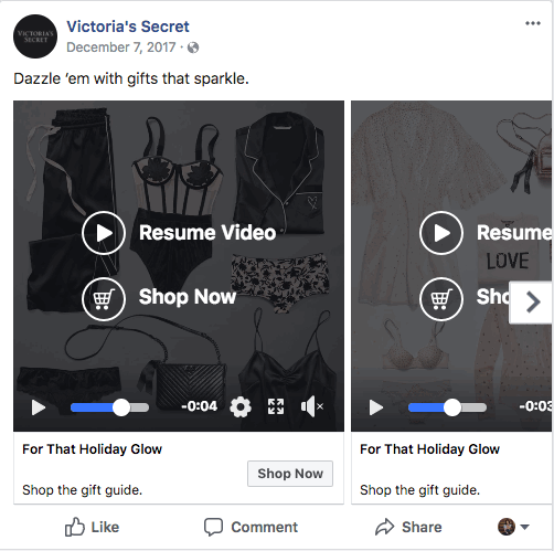
Let’s break down the basics for this ad. You’ll see that its a carousel with five different frames. They start with a body copy that says, “Dazzle Them With Gifts That Sparkle,” and in each frame as you scroll through, you’ve got a cute little gif and each one of them moves.
What’s Working?
So, let’s talk about what’s working. First of all, I love a flat lay. Do you know who else loves a flat lay? Every single women on the internet. Now, that could be an absolute overestimation, but from our experience, flat lays always perform.
One, they’re beautiful.
Two, it’s a great way to showcase product diversity in a really beautiful aesthetically pleasing way.
Gifs!
What else I love about this … that they’re gifs and those are not hard to make. Really, it’s just one product. One little thing is moving, whether it’s a color or it’s an accent or a vector, is kind of slightly tilting like what they did. It can dramatically increase the engagement with your ad.
So, as we all know, video is overtaking everything, and maybe you don’t have a robust video team. Using gifs, especially with a flat lay format, can be a really easy way to make all of your campaigns move. So, that’s great.
Let’s move on to what’s not working so well.
What’s NOT working?
I want to see if you notice anything. The hint would be the headline and the sub-headline. They’re all the same, every single one. Every single one says, “For That Holiday Glow.” That’s a pretty empty headline to begin with. I wouldn’t suggest that even if it was a single frame shot. It lacks incentive. It lacks a benefit. It really lacks any type of emotion that’s going to inspire somebody scrolling through the newsfeed to click.
So, what could they have done? Well, they could’ve categorized who you’re shopping for, gifts for mom, gifts for your bestie, gifts for you. That could be a little tricky because we’re talking about lingerie, but most of the time with a not so polarizing or kind of awkward product like lingerie, it would definitely work. Another idea would be if the flat lay had been product-specific, so in each frame they had bras or undies or robes. They could’ve said, “Shop Bras, Undies, Robes.”
Takeaways
The main takeaway is that that carousels are by far the easiest and I think, as a creative director, the most fun way to tell a brand story, to highlight product diversity, to show benefits, to show features. You can even go on the rebound and address every single customer hesitation or objection to your product within each single frame.
Well, I hope you found some of the tips that I shared helpful and they can totally inspire your next campaign creative. If you liked what you saw, go ahead and subscribe.
We will be back next week with another ad, and if you’re reading this, and you’re like, “You know what, I’m done doing Facebook ads on my own,” we totally get it. We would love to work with together, you can go here to get a hold of us.
JOIN OUR DAILY EMAIL LIST TO SEE EVEN MORE CREATIVE