Company: Criquet Shirts
Homepage Tagline: High performance shirts for the 19th hole. Dress well, do good, enjoy life.
What’s their specialty? Organic golf shirts and polos
Platform for ad below? Facebook

The good:
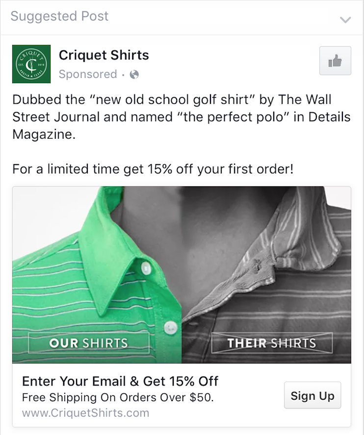
Criquet is combining a lot of power techniques in one ad here.
The first sentence name drops WSJ and Details Magazine, which gives social proof to the brand and lets you know that they aren’t some random company that just started. This also validates that their shirts are high quality.
They are invoking urgency in the second sentence by running a limited time sale. It’s important to give people a reason to act now and buy today because without one they usually tend to bookmark it and forget. There are other ways to do this besides a sale.
For example, if your product is an iPhone case, your copy could urge them to protect their phone with your case asap before they drop it next.
The complicated:
This image is both the strongest and weakest point of this ad.
Comparison images can have a powerful impact. Having an instant demonstration of the product and the unique selling proposition is great. Not all products are this instantly demonstrable, but if yours is, you should absolutely be doing something like this.
My only hang up with the image is that it looks slightly like an infomercial and might be taking away some of the high-end branding value that Criquet is going for. I see that the collar is obviously crisper, but the high saturation on the left and b/w on the right reminds me of a dish cleaner infomercial.
The could be better:
I’d either make the image more tongue in cheek and play up the fact that it looks like an infomercial, or change the shirt on the right to be a muted color instead of b/w.
Otherwise, Criquet Shirts totally nailed it. They used social proof, created a reason to act immediately and had an almost perfect comparison image.
